10 SaaS Referral Program Examples
SaaS companies are changing the way we work, whether it’s collaborating with colleagues or keeping track of our personal to-do lists and notes.
For both B2C and B2B SaaS companies, customer referral programs are proving to be a wildly valuable avenue for new business.
We’re taking a closer look at some of the top SaaS referral program examples to show how brands use in-app marketing and a streamlined user experience to get real results. Dive into the structure of each program, what makes it unique, and what you can apply to your own program.

1 - Canva
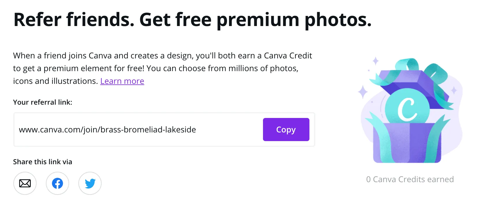
Canva is a graphic design platform that makes it easy for anyone to design high-quality posters, social media graphics, presentations, and more.
Referral Program Setup: Refer a friend to Canva and receive a credit to exchange for a Premium Canva element like stock photo, icon, or illustration.
What we like about it:
- Rewarding users with free Premium elements boosts engagement and gives users a reason to come back to use the app another time, and may entice a user to upgrade to a paid subscription if they find significant value in the exclusive elements.
- The Canva referral program widget often pops up as soon as you’re done exporting a finished design to your computer, making excellent use of those “happy” customer moments when someone is more likely to want to share a product with a friend.
2 - Dropbox
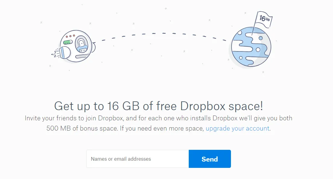
Dropbox is a file hosting service for individuals and businesses, also offering tools for companies to collaborate and streamline workflows.
Referral Program Setup: Refer a friend to Dropbox and you’ll both earn 500MB in additional storage space. Keep referring to earn up to 16GB in free storage.
What we like about it:
- Dropbox was one of the first to reward referrals with a currency that didn’t have a direct monetary value. Rewarding with additional storage increases a user’s engagement with the app, and is something that can’t be transferred anywhere else.
- It’s hard to make a list of top SaaS referral programs without mentioning Dropbox. This SaaS company is famous for achieving 3900% growth over 15 months with the help of their customer referral program, demonstrating how powerful it can be for brands with a solid product and enthusiastic customer base.
3 - Airtable
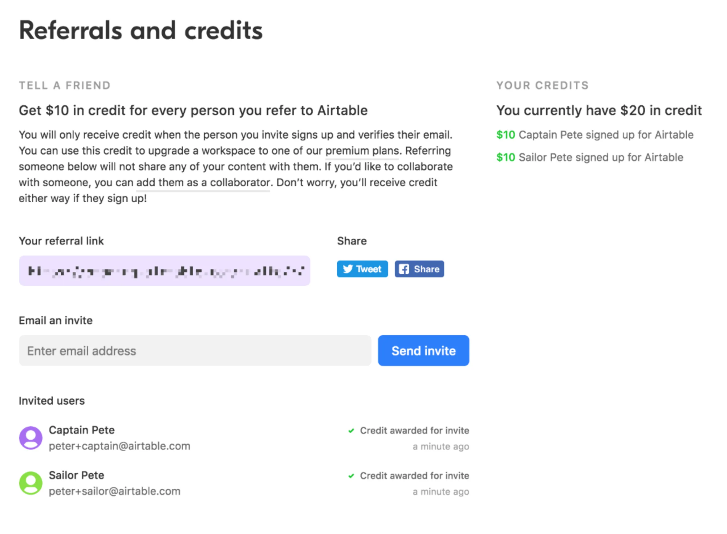
Airtable is a cloud-based collaboration tool that combines the “power of a database with the familiarity of a spreadsheet,” allowing teams of all sizes to stay on track with projects and planning.
Referral Program Setup: Refer a friend to Airtable and receive a $10 credit towards any paid Airtable plan.
What we like about it:
- By rewarding referring users with a credit towards a paid subscription (as opposed to just giving one free month), those on the free plan are provided with extra encouragement to upgrade and cash in their reward. If the user sees value in the premium features, they’ll either keep referring to earn more credit, or simply pay the monthly price - either way a profitable outcome for Airtable.
4 - Todoist
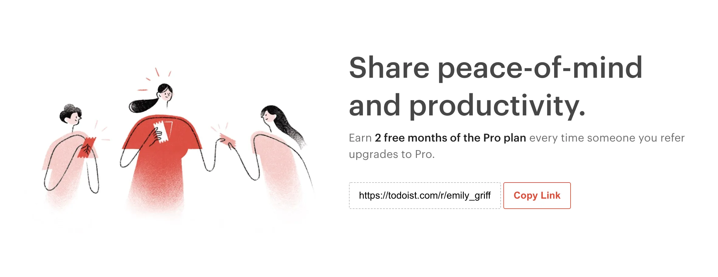
Todoist is a task management application similar to Evernote or OneNote, letting you manage personal and professional tasks across multiple devices.
Referral Program Structure: Refer a friend to Todoist and earn 2 free months of the Pro plan once they upgrade to Pro.
What we like about it:
- Todoist takes a unique approach by only offering their advocates a reward once their referred friend upgrades to a paid Todoist Pro Plan. While this does make it more challenging for rewards to be earned, it does encourage existing customers to make an effort to communicate the value to new users in order to convert the referral.
- With each user that signs up for a paid plan, Todoist earns another customer to advocate for the value of the Pro plan and keep the referral cycle going.
5 - Trello
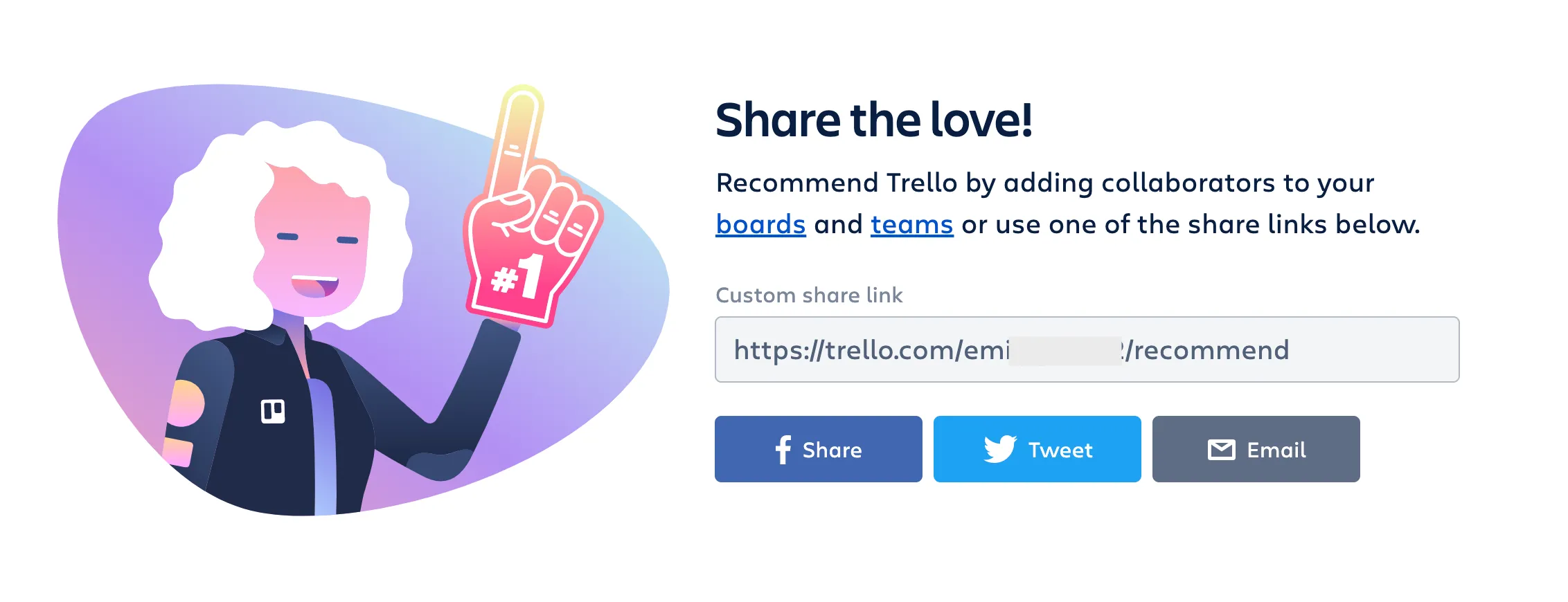
Trello is a Kanban-style list-making application for personal and professional productivity.
Referral Program Structure: Refer someone to Trello - either by sharing your unique link or inviting someone to work with you on a Trello board - and earn a free month of Trello Gold.
What we like about it:
- Like many paid subscriptions to SaaS tools, the premium benefits are often only realized when the user has had a chance to try out the features for themselves. Since a good amount of people will sign up to Trello only planning to use the free version, giving them an easy way to experience the premium experience is the best way to encourage them to convert.
- Trello makes their rewards easily accessible, as the referred user only needs to sign up and verify their email address in order for the free month of Trello Gold to be earned, once again increasing the potential of converting more paid users.
6 - Milanote
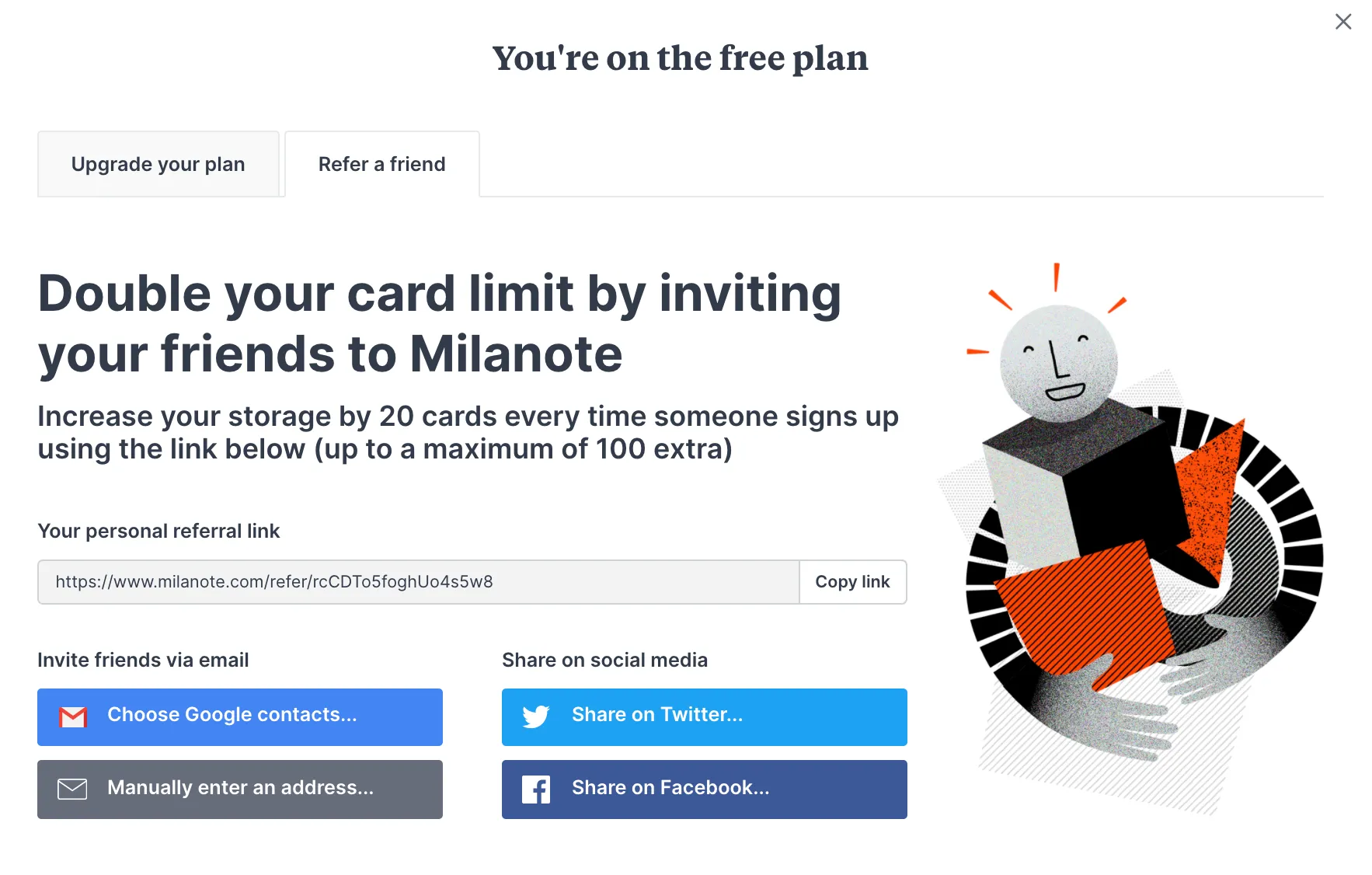
Milanote is an online tool for creatives to organize ideas and projects onto visual boards with note cards, to-do lists, images, and more.
Referral Program Setup: Refer a friend to Milanote and increase your storage by 20 cards when they sign up with your link.
What we like about it:
- The referral program widget is placed in the same popup when viewing the options to upgrade your Milanote plan. Not only does this add an extra incentive for who users who want more cards but don’t want to pay for the subscription, but can also work to convince heavy Milanote users that upgrading to a paid plan will suit their needs even more.
- Rewarding referrals with more cards directly increases a user’s commitment to Milanote, lowering the likelihood that they would want to switch to a competitor.
7 - Alteryx
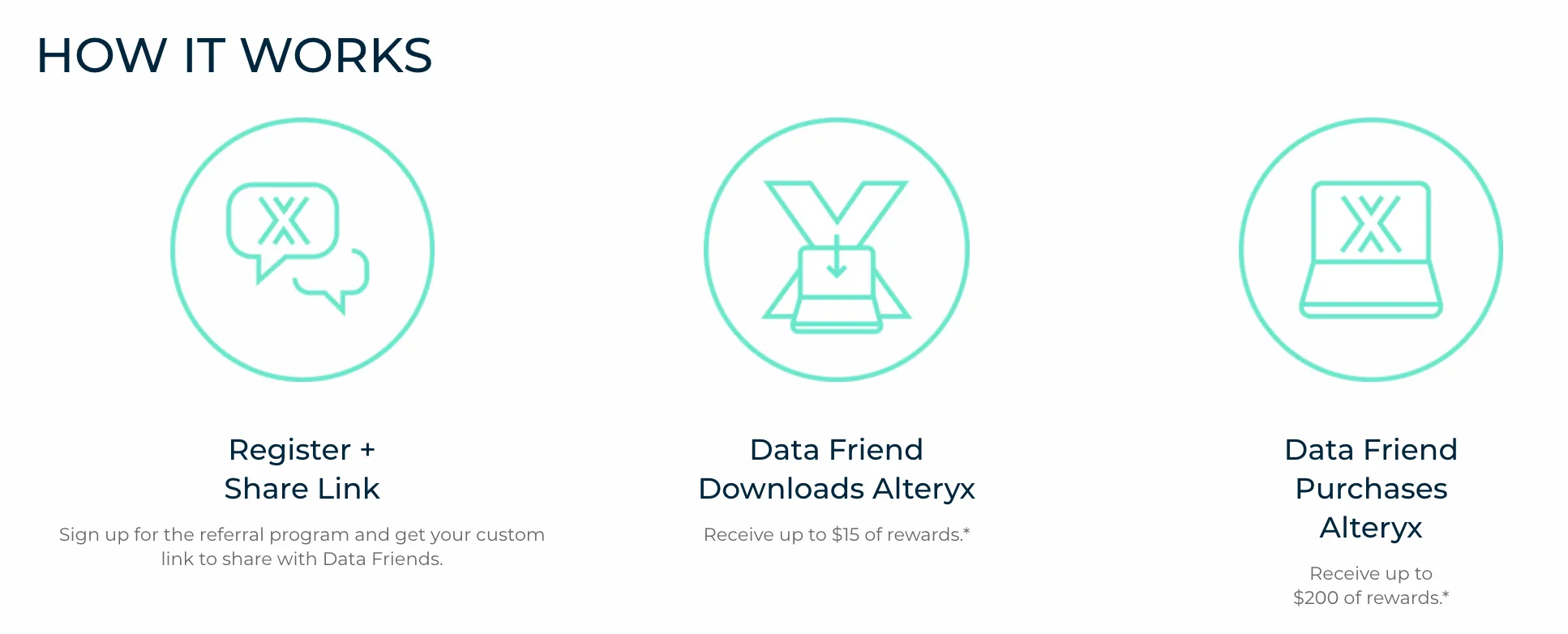
Alteryx is a data science and analytics platform bringing simple and powerful insights to everyone.
Referral Program Setup: Refer a new user and earn up to $215 worth of rewards - $15 when your referred user downloads Alteryx, and $200 more when they purchase Alteryx.
What we like about it:
- Alteryx designed a multi-step program to reward advocates as the referred users move through the process of becoming a customer. This approach helps keep advocates and referred users motivated throughout longer sales cycles, especially in a B2B environment.
- Credit earned from making a referral can be redeemed for a choice of rewards such as gift cards, swag, or a charitable donation. Not many customer referral programs offer a selection of rewards, but participation and engagement in the program are bound to increase when rewards appeal to multiple customer segments.
8 - Jobber
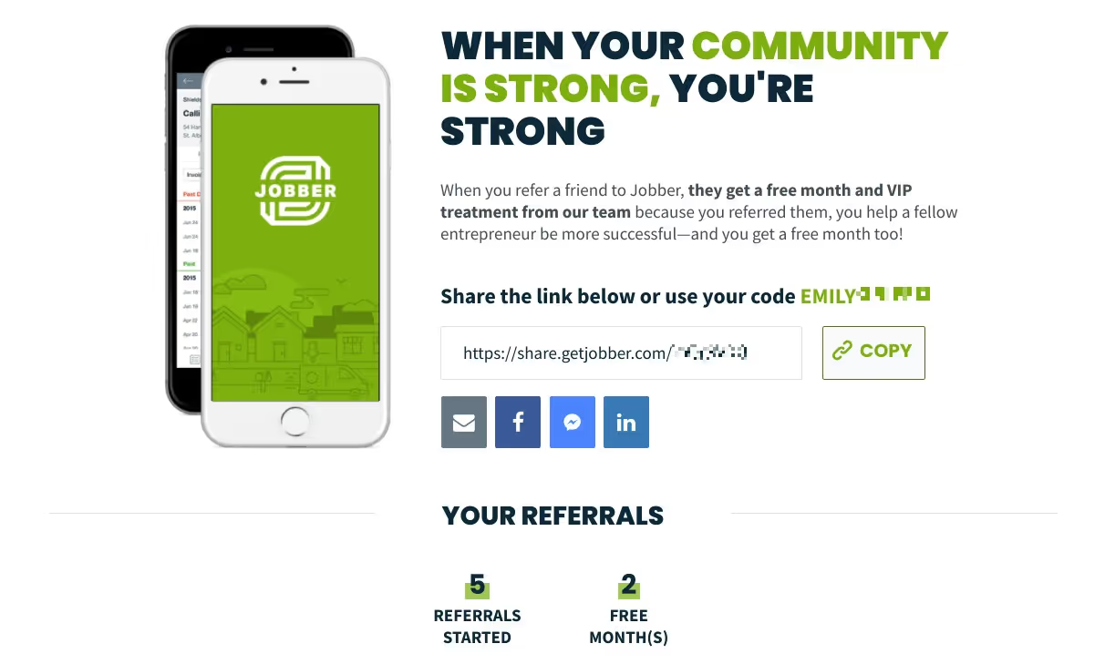
Jobber is a business management platform for small home service businesses, including lawn care, HVAC, plumbing, residential cleaning, and more. Unlike spreadsheets or pen and paper, Jobber keeps track of everything in one place and automates day-to-day operations.
Referral Program Setup: Refer a friend to Jobber and they’ll receive a free month when they sign up. The referring user is rewarded based on how they use the product: Account owners will receive a free month of Jobber for every successful referral, and if you are not an account owner you’ll receive a $50 gift card for each successful referral.
What we like about it:
- To add a level of personalization and engage all types of advocates, referring users are rewarded differently based on how they use the software, depending on if they pay the bill or not. This distinction can be an important factor in determining a program’s success.
- Jobber’s referral program is built around the sentiment of “community over competition”, and branded with the message that referring another small business to Jobber doesn’t mean letting someone else get ahead, but means helping build a stronger community of successful entrepreneurs.
9 - Clubhouse
Not to be confused with the popular social audio app, Clubhouse is a project management tool to help modern software teams work collaboratively and ship quickly.
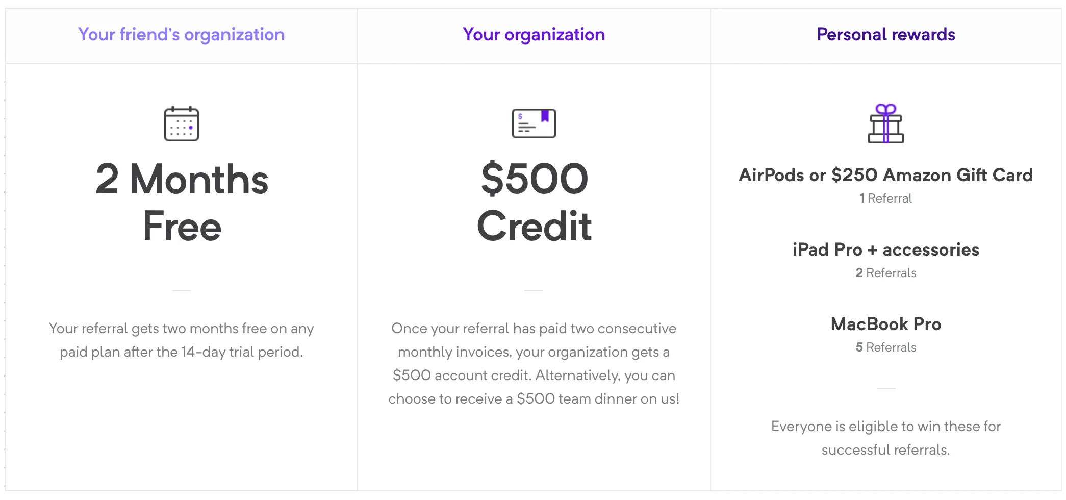
Referral Program Setup: Refer a friend’s organization to Clubhouse and they'll earn two free months of a paid subscription. You’ll earn a personal reward like a gift card or AirPods, and your company will receive a $500 bill credit.
What we like about:
- We’ve all heard of double-sided referral programs, but Clubhouse takes this a step further with a triple-sided reward structure. Since the typical referring customer is an employee of an organization using Clubhouse, the program rewards both the individual user and their company for every successful referral, playing to the motivations of everyone involved.
- Clubhouse also makes use of reward choices (company credit or company dinner) and a tiered structure to make the referral process worthwhile and increasingly rewarding.
10 - Coda
Coda is a cloud-based document editor that lets teams collaborate and share project ideas with intuitive templates and organization capabilities.
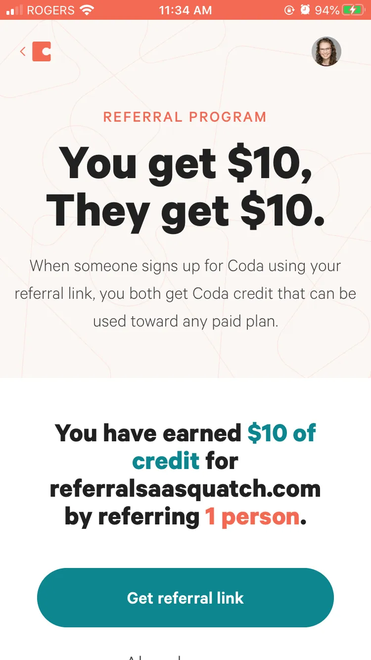
Referral Program Setup: When someone signs up for Coda using your referral link, you’ll both get $10 in Coda credit that can be used toward any paid plan.
What we like about it:
- Not all SaaS brands make their referral program accessible in both their web and mobile app, but Coda integrates it into both channels for the maximum amount of conversion opportunities.
- A unique feature of the program is that if you’re a part of multiple workspaces under one account, you can select which workspace you’d like to earn credit for before sharing your link.
Quick Tips for a SaaS Referral Programs
Strategize to build customer retention
It’s no secret that one of the keys to SaaS success is keeping customers active and paying regularly. Your referral program rewards can be used strategically to help capture the attention of your best users and show them the irreplaceable value of your paid features.
For example, when Trello rewards referrals with a free month of Trello Gold, customers get to fully experience Trello’s top features. This is one of the easiest ways to let users familiarize themselves with the premium benefits and see the value in upgrading.
Make it accessible for maximum conversions
One of the most common pitfalls of a SaaS referral program is that companies either don’t bother, or forget to promote it within their website or app. Customers will only use a program if they know it exists, so it’s important to make it visible in relevant menus within your app.
If it makes sense for your customer base, integrating the program into your mobile app is also a great way to maximize conversions. If customers spend a lot of time in your mobile app, take advantage of their “happy moments” after finding success with your features, increasing their willingness to refer.
Know your business and know your customers
While many SaaS brands share a similar underlying business model of relying on recurring revenue, B2C and B2B companies have their differences that can’t be ignored when it comes to program structure and rewards.
For example, B2B brands often deal with longer sales cycles, and multiple advocates with different motivators. Clubhouse and Jobber are excellent examples of programs that offer different rewards depending on the role of the referring user, while Alteryx takes advantage of a multi-step referral program to help initiate the referral and keep the process moving.
Follow it up with a loyalty program to maintain momentum
While a well-designed referral program can have a major impact on customer acquisition and retention, following up with a loyalty strategy is a smart way to retain and increase the value of your new customers.
For example, once a referred customer is on board, you can offer rewards for the completion of specific actions that get them more involved with your product or service. This can be actions like logging in a certain amount of times, downloading your mobile app, or trying a new feature.