Looking at Typeform’s Referral Program User Experience
 When you love a product you’re willing to share it with your friends and family. That’s been the case for Typeform as their visual-focused approach to survey and feedback software has been turning heads since 2012.
We’re going to go over the user experience flow of making a referral for Typeform, but first we should talk about why this is important.
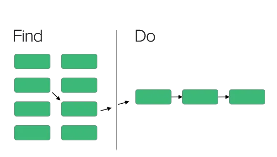
When product teams think about well-designed software, they want it to do two things. Give users the ability to navigate and find the information they’re looking for in their IA(Information Architecture). As well as reduce choices/noise when they need to concentrate on the do – User Experience (UX).
In a perfect world information is neatly organized and users can find the information they need and have a structured way to use it within the product. I illustrate this below in a basic IA/UX flow.
 Now what does this have to do with referral programs?
Well everything actually..
Just like designing your main workflows a referral program need to be placed prominently inside a product so the user can find it and have an intuitive flow once the user wants to make a referral.
Main Dashboard
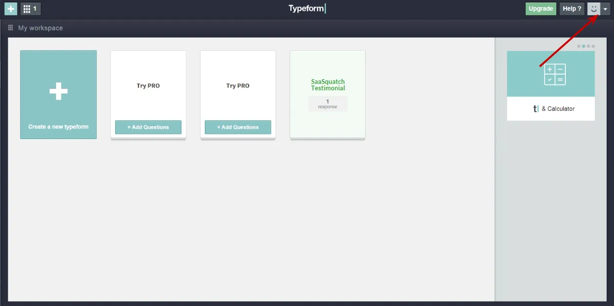 Typeform’s workspace dashboard is organized to give users a card-style visual interface to perform their main tasks – creating and analyzing surveys.
Additional information is placed in the upper right of the dashboard. Where a user can access a drop-down menu to find their account settings. They also use visual cues like the slider in the top right to show users additional options like popular integrations and new features.
This dashboard is where a user will spend most of their time in their find stage. Checking in on surveys they’re running, creating new campaigns, interacting with support, etc..
Clearly a natural place to promote their referral program.
I would recommend replacing the upgrade button at the top-right menu with a referral CTA like “Earn a Free Discount” or “Give 10% Get 10% off”
They can also promote the referral program in their rotating slider for a bigger visual cue and to draw the users eye in with a sliding animation.
Account Section
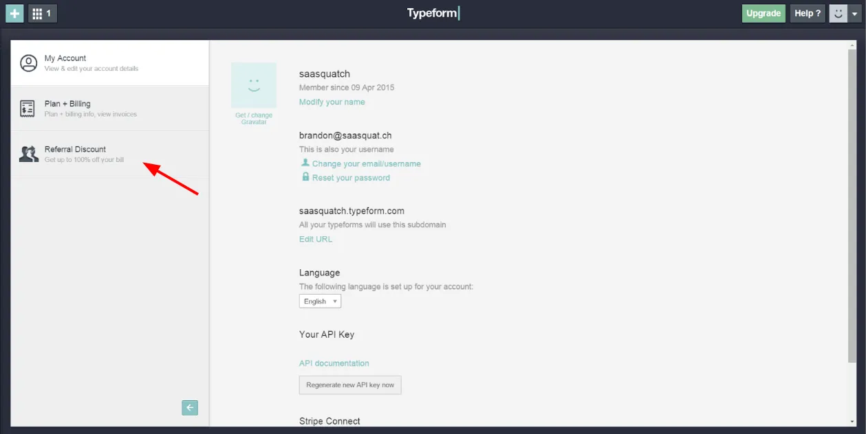 Now that the user has landed in the account settings page they are given three panels on the left to navigate and find their user information, plan & billing and discover the referral program.
Account settings is a popular placement for a referral program that we’ve seen companies use. Though I expect a user is more interested in focusing on the do behavior when they navigate to this tab as they have a clear goal when they head to their account page.
Typeform can experiment with enticing UI text to encourage a user to click the tab and learn more about the referral program. We’ve seen companies promote the initial reward amount – For example ‘Earn a 10% discount when you refer your friends’ ‘Give 10% and Get 10% refer your friends to Typeform”
Referral Program Homepage
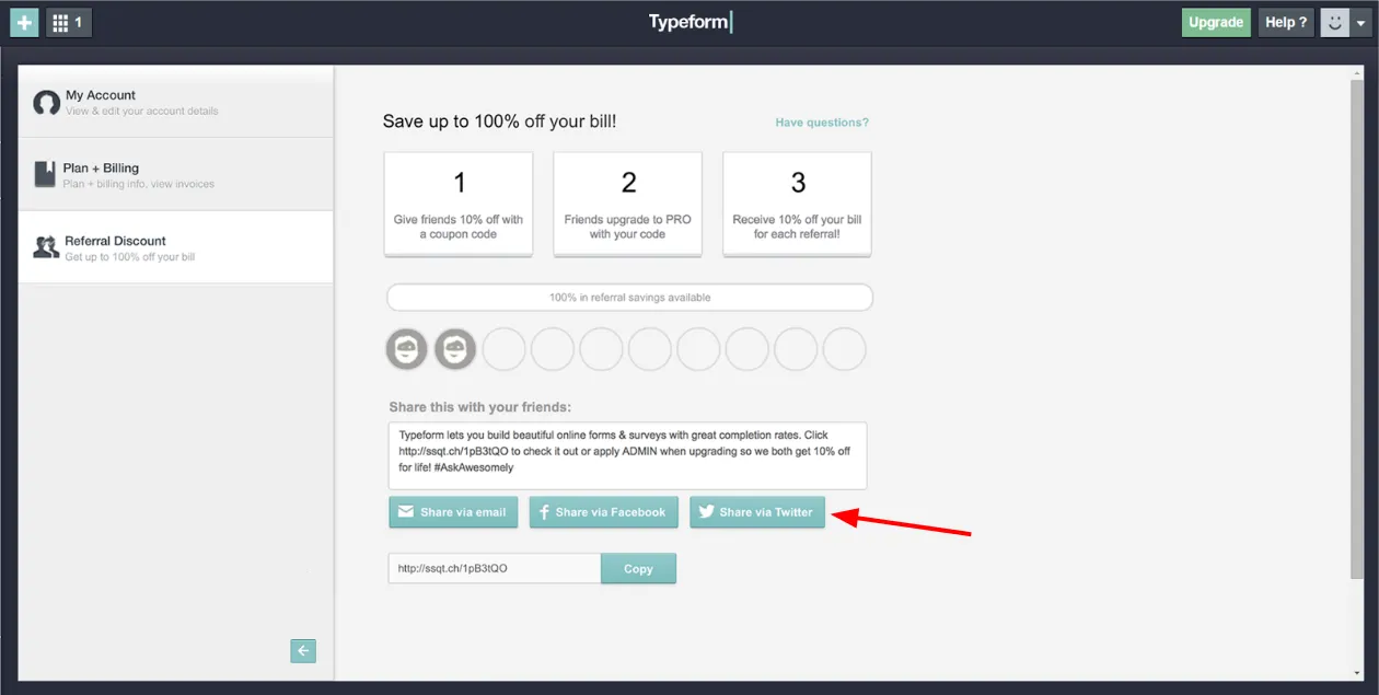
Now that a user has found the referral homepage your program should help the user concentrate on making a referral (the do). Typeform does a great job with their 1-2-3 approach to explain the basics of the program.
-What they need to do.
-What their friend needs to do.
-When the reward is earned.
After reading the basics of the program the user and deciding they want to continue the user will see four different options to share their referral code. Via email, Twitter, Facebook and Copy/Paste.
The referral comes with pre-filled text for the user to help them concentrate on which one of their friends would want a referral instead of first writing a message to sell your product.
Social Share
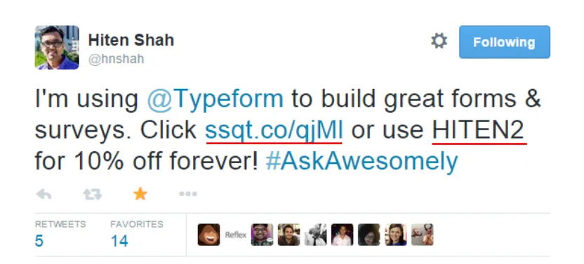 In this example the user chose to share their referral code to their network through Twitter. When the user clicked the button they are prompted to sign in to Twitter and confirm the tweet. Three clicks and the user can complete the referral flow and get back to their workday.
The user didn’t need to think about creating a separate referral account, writing the text to promote Typeform. They are able to maintain their momentum and make the referral without jumping through unnecessary steps.
Sign-Up Process
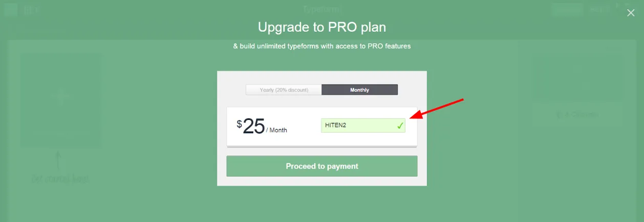 Now when a newly referred user clicks on the link they are prompted to sign up for Typeform. Our referral attribution is able to remember who that user is and apply the referral discount code whenever the referred user wants to upgrade to a Pro account.
We display the referral discount code on the pricing selection page displayed above so the user knows they will be getting their discount. Placing the discount on this page helps increase referral conversions as the user wants re-assurance that the referral is properly tracked during this stage.
Final Thoughts
Creating a product that focuses on the end user experience is no easy task. Creating structured navigation so your users can find what they’re looking for and reducing distractions so your users can do their tasks are essential to creating products that customers love.
Typeform’s product team does an incredible job thinking through their user experience to create loyal customers. Their design-focused surveys, management dashboard and in-app customer referral program are essential to its continued growth.
Referral programs need the exact same care and consideration that you use when building your core features. As there’s many hurdles you have to get by in order to engage your users at the right time(the find) and simplify the act of making a referral(the do).
If you’re interested in checking out Typeform’s survey and feedback software you can visit their homepage here.
