How The Uber Referral Program Thinks About User Experience
(Source)
We all know about the transportation company Uber, they’ve been the envy of the startup world and the model most angels and venture capitalists look for in the seed/series A stages.
But how have they done it?
It all comes down to the end user experience.
Uber’s founders saw that the way a consumer orders a cab/private car hasn’t changed for decades. Even though we have this incredible technology in the palm of our hands.
With an innovative mapping interface, frictionless payment process and in-app referral program the company quickly won the hearts of their customers.
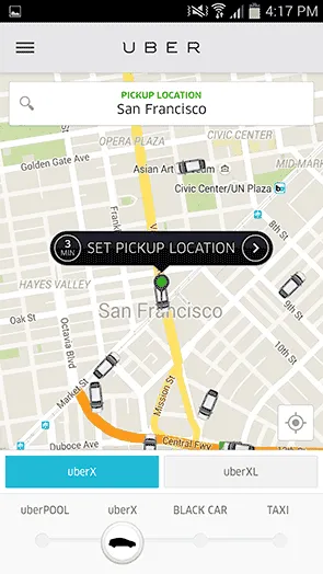
Put the cars on a map
This is the element that most consumers talk about as the key differentiator and why they can’t go back to ordering cabs over the phone. By tracking every one of their drivers on the road Uber is able to get you to convert.
It simulates the action of hailing a cab from the street-corner. The on-demand nature of ordering a ride is an addicting experience and can quickly turn into your preferred mode of transportation.
Frictionless Payment
Another aspect that makes Uber such a successful product is its friction-less payment. We’ve all experienced the awkward exchange of paying cab fare, especially if you don’t have cash.
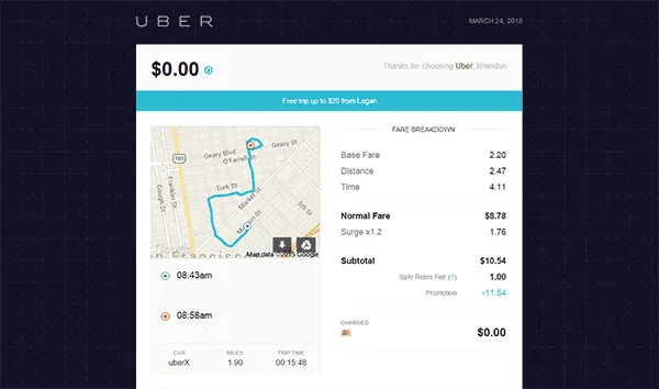
With Uber’s app and tight integration with Braintree you’re able to upload your credit card and are automatically for your rides. No more fussing around with credit cards, just a quick and painless transaction.
In-App Referral Program
With an amazing product Uber still has to compete with the established taxi/private car industry as well as a growing number of competitors as they launch city-by-city across the world.
One of their main sources of new customers is through their customer referral program. By incentivizing their current userbase to invite their friends they’ve been able to scale their organic word of mouth into a profitable acquisition channel. Important areas of the program are the double-sided rewards and streamlined user experience.
The Referral Program Experience
Discovery
App Open Interstitial
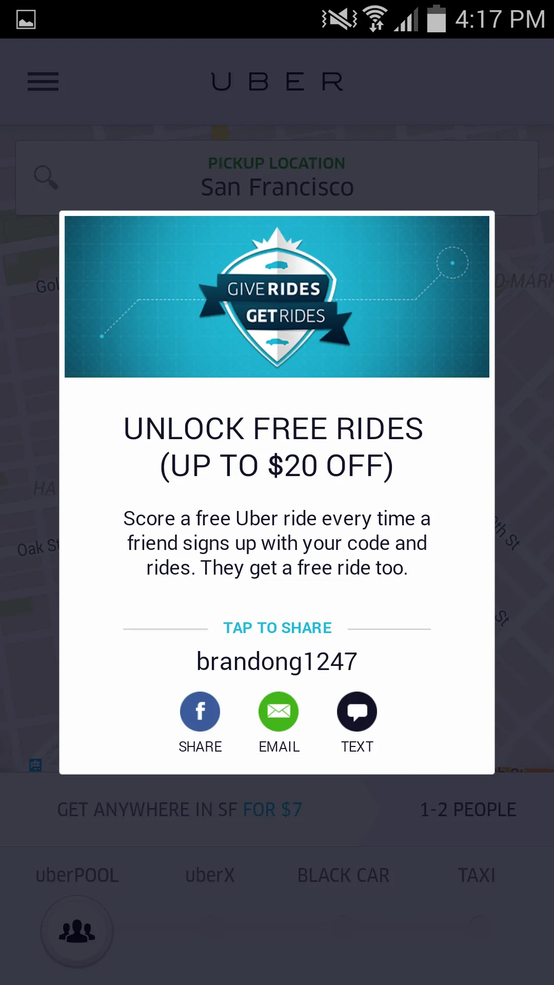
When I first open my Uber app I’m prompted with this referral program interstitial ad.
The landing page uses a big header to grab my attention and tells me about the potential reward right away. The supporting text gives me the key details of the program without saying too much. And most importantly, they have the referral code tied to a simple tap-to-share interaction.
Another tactic to note is the use of a black overlay on the rest of the app to focus my attention on the referral program offer.
An area they can look to experiment with is the header text. I feel the “up to $20” isn’t a firm Call to Action when compared to other options like “Give $20 to Your Friend and Get $20” “Earn $20 When Your Friend Signs Up”
Menu Navigation
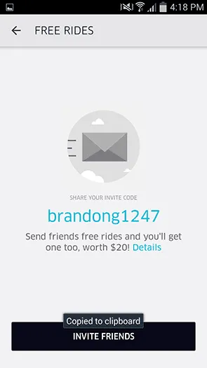
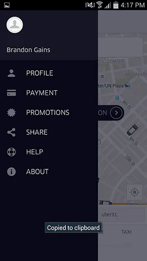
When you open up the Uber app menu you’ll see the share button as one of your six options. You’ll see that the program is placed prominently in the menu directly above the Help section. This referral program placement is important to note as it creates organic discovery of the referral offer without disrupting the user experience.
Many apps will hide their referral program behind Settings tabs and other areas of their apps, which hurts overall program performance as it diminishes the natural discovery opportunity.
If Uber is looking to improve the discovery of their program I’d suggest they experiment with a different icon and copy. ‘Share’ doesn’t convey that a user can give out and earn free credit for making a referral. As well as the tri-circle share icon which lets a user know that they can share but not that they can earn.
My suggestions would be a ‘$’ icon and “Earn Free Credit” copy. That way the user knows what they’re getting into and not surprised when they tap into the referral program homepage.
Share Prompt
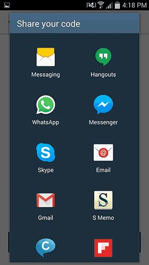
By using the native Android OS share functionality, Uber gives their users many different ways to share a referral code. If I want to share with my co-worker I can use channels like Slack or Email, if it’s with my friends I can use more personal messaging apps like Messenger or WhatsApp.
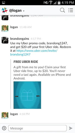
In this example I want to share my referral code with my co-worker Logan. Our team uses Slack for collaboration and is the primary office-chat app that we use.
So I simply pick Slack as the app I’d like to share the referral code through and find Logan. Notice that the share code has pre-filled copy for me so I don’t have to think about the value proposition of the referral offer.
This copy is a small amount of text that gets across the value of the referral offer “Use my code and get $20 off your first Uber ride”
Simple enough right? Well you’d be surprised by how many referral programs I encounter that make their copy confusing for users.
Simplifying the entire program into one crystal clear tagline comes naturally to some but can be difficult for others as there’s so much information to choose from. You have to consider what the offer means to the end user, not what the goal is for your company.
Typically there’s three reasons someone makes a referral:
-Social status (I’m looking to impress you)
-Social credit (I can get you a deal)
-Self-interest (I want to get something myself)
Referral Landing Page – Desktop
Referral Landing Page – Mobile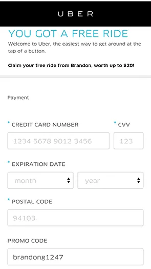
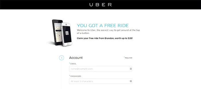
I’m showing both the desktop and mobile versions of the referral landing page because it’s important to look at how users will interact with an offer depending on what device they’re using.
When that link is clicked/tapped the referred user IE Logan – will open up this landing page to sign up and claim his free credit. If Logan is at his workspace he’s most likely going to open the link on his desktop computer, he’ll have access to a keyboard and it’s easier for him to enter in all of the required information. CC info, postal, street address, name, etc..
If he’s on his phone he won’t have time to enter in all of that information and it becomes a weak area in the referral conversion flow. Uber should have a simplified version of their signup form for mobile users, as the majority of their users are mobile.
Final Thoughts
Uber’s product team does an incredible job thinking through their user experience to create loyal customers. The unique mapping interface, frictionless payment and in-app customer referral program are essential to its global expansion.
The breakdown of their referral program also shows that even a company like Uber can find areas to improve their referral program performance. They need to think through each step of the process and make sure it’s easy for the end user to make and claim their referrals.
