Top Mobile Referral Program Examples
We spend 3 hours and 15 minutes a day on our phones.
Whether your brand is predominantly mobile, or balances both desktop and mobile apps, growing your business with customer referrals means engaging users where they spend the most time.
According to Google, 89% of people are likely to recommend a brand after a positive brand experience on mobile. So how do you leverage this and design a referral program for your app that drives growth?
If you’re looking for mobile referral program ideas, where to place the CTA in your app, or what to include as default share messaging, you’ve come to the right place!
We’ll show you our favorite mobile referral program examples, why we love them, and what tips you can apply to your own referral program.
In this list:
1 - Rakuten
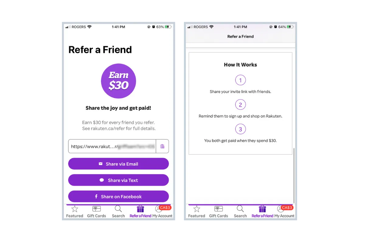
Rakuten is one of the most well-known cashback websites. When you make an online purchase through Rakuten, you can receive up to 30% cashback on regular purchases. You simply shop as you normally would on websites like Amazon, Indigo, Nike, and Sephora, and Rakuten mails you a cheque with your cashback balance.
Referral Program Setup: As an existing user of Rakuten, earn $30 for every new friend that you refer. When your friend makes their first purchase (of $30 or more), you'll both receive $30 (as a limited-time promotional reward).
What we like about it:
- Rakuten offers a fairly generous reward with the only condition being that the referred user spends $30 within a year of signing up. Given that it’s normal for an online purchase to exceed $30, this can be easily achieved.
- Cashback websites like Rakuten can be met with skepticism from new users. Taking this into account, it’s wise for Rakuten to depend heavily on existing customers to advocate on its behalf, encouraging them with a substantial reward.
- As far as Rakuten’s mobile user experience (UX) goes, the “Refer a Friend” call to action (CTA) is clearly placed along the bottom of the app screen with a supporting gift box icon, and communicated in three easy steps with plenty of share mediums to choose from.
What would make it even better:
Rakuten’s Refer a Friend page on their desktop website offers a “Your Referral Activity” table to show you what friends have signed up with your code. This would be a valuable addition to the mobile app given the amount of shopping that is done on mobile.
2 - KOHO
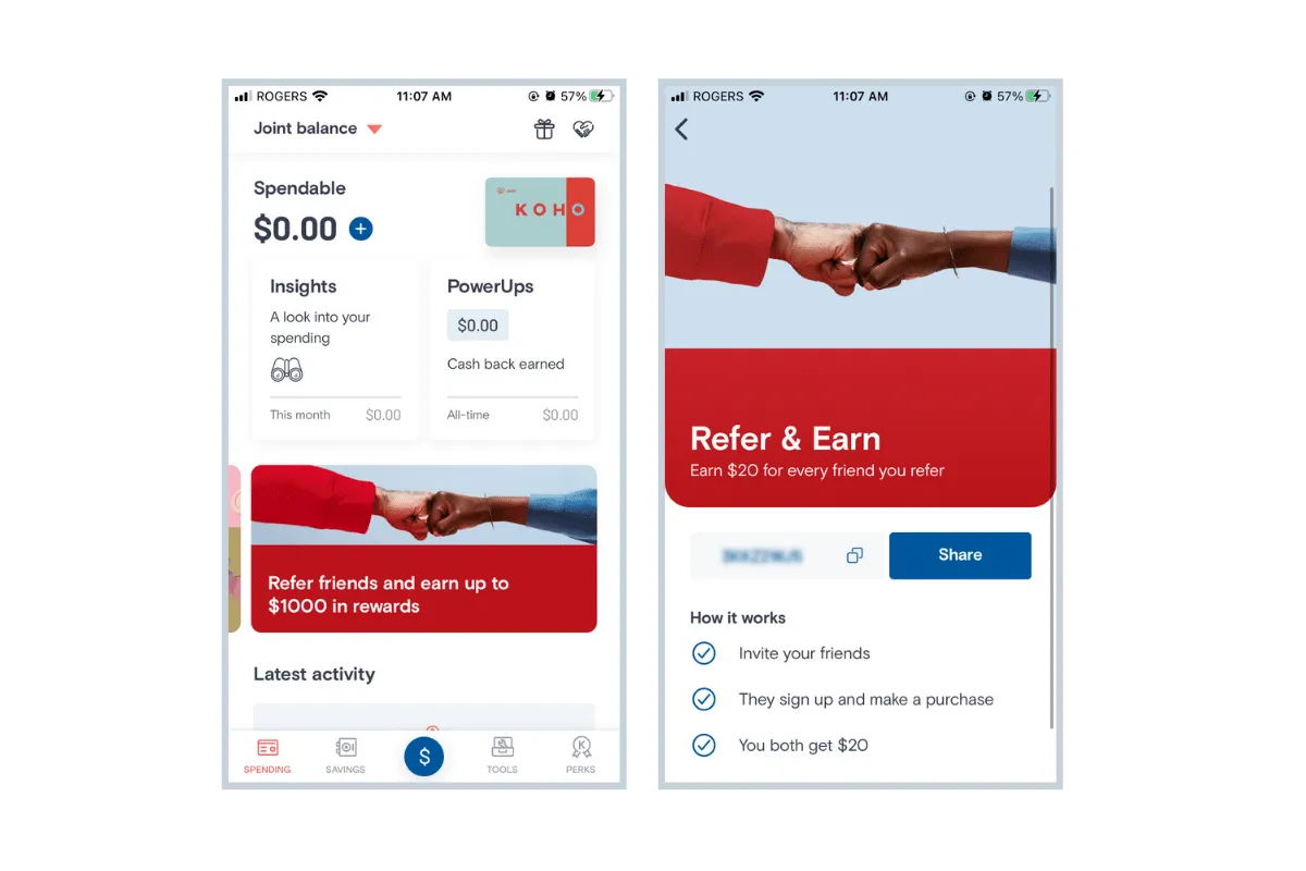
KOHO is a financial brand that offers a way to manage your spending and saving habits similar to a checking account, but with the added perks of a credit card. Users load money onto a KOHO card, use it like a Visa, and receive cash back on purchases.
Referral Program Setup: Refer a friend to KOHO and you’ll each earn $20 after they make their first purchase with their KOHO card.
What we like about it:
- KOHO’s referral program is consistently promoted within their app and also through email and push notifications. The in-app CTA’s are colorful and enticing, and quickly get users interested in the program.
- Usually, cash can be a difficult reward to give out, but it directly relates to why people sign up for KOHO - to save and spend. Depositing $20 into the accounts of referring and referred users is both simple and an excellent way to keep them using the app.
- KOHO also runs limited-time contests around their referral program, such as entering referring users into a draw to win a cash prize of $1000. Additional CTA's are strategically placed on app screens with heady traffic to further direct users to the referral screen.
3 - HotelTonight
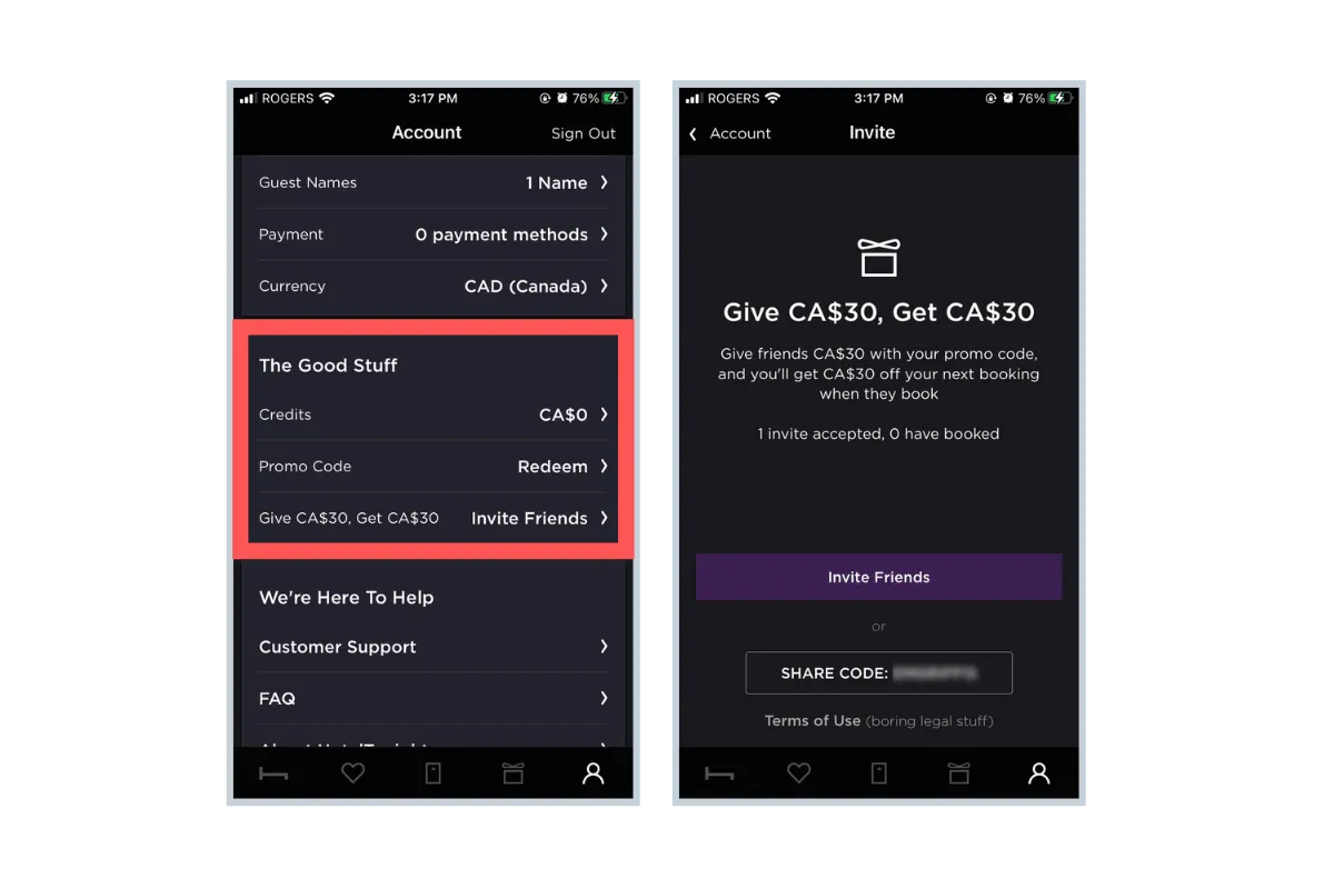
Hotel Tonight is a hotel booking app and website aimed at helping last-minute travelers score discounted room rates.
Referral Program Setup: Give $30, Get $30 - Give friends $30 off with your code, and you’ll receive $30 off your next booking when your friend reserves a room at a qualifying rate.
What we like about it:
- The “Give $30 Get $30” is a clear and simple proposition that benefits everyone involved. Plus, the default messaging to friends includes the minimum amount that must be spent on a booking to qualify for the reward, to counter any confusion or miscommunication during the referral.
- When you start to refer friends, the app's Invite screen will display your invites accepted, friends who booked, and your resulting balance, so everything you need to know is in one place. When you're made aware of credit you've earned, you're more likely to make a purchase in order to use it.
4 - Duolingo
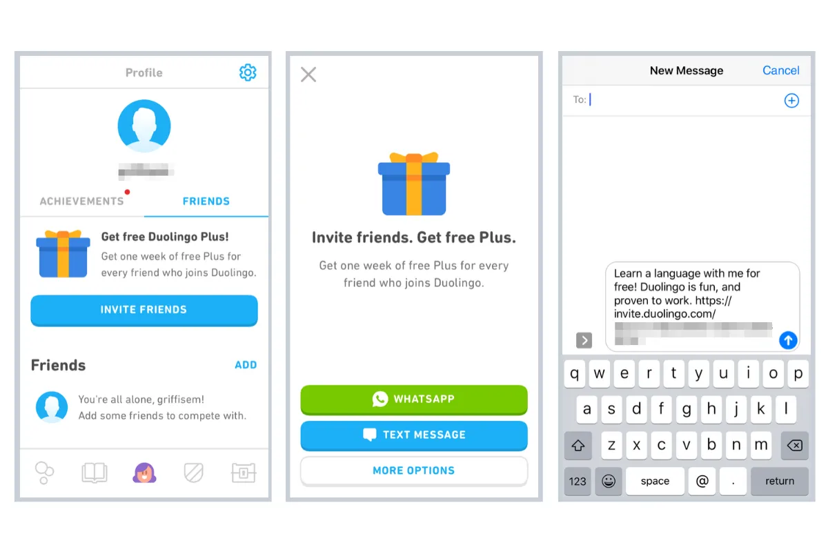
Duolingo is an online language-learning platform with both a desktop and mobile app. The brand is known for using gamification to encourage users to keep making progress with their chosen languages.
The app can be used for free, but offers a paid subscription which grants access to an ad-free experience, offline lesson downloads, and more features.
Referral Program Setup: Get one week free of Duolingo Plus for every friend you refer to the app.
What we like about it:
- Giving users a free week of Duolingo Plus with each referral is a great way to expose them to the paid offerings. It makes sense that the brand hopes users will realize the benefits of the paid tier, and either keep up referrals to use it for free, or start paying for it themselves in order to not lose access.
- Duolingo's in-app referral screen and buttons perfectly match the look and feel of rest of the app, making it a seamless experience.
- Even though it’s different than the typical “Give $10, Get $10”, Duolingo does a good job of clearly explaining the program with the concise “Invite friends. Get free Plus” tagline.
What would make it even better:
We should note that this is one of the only examples in our list that isn’t double-sided. The new user being referred does not receive an incentive. It works in this case since Duolingo can be used entirely for free, though the offer could be more enticing by giving new users virtual coins to use, which is of no real cost to the brand.
5 - Instacart
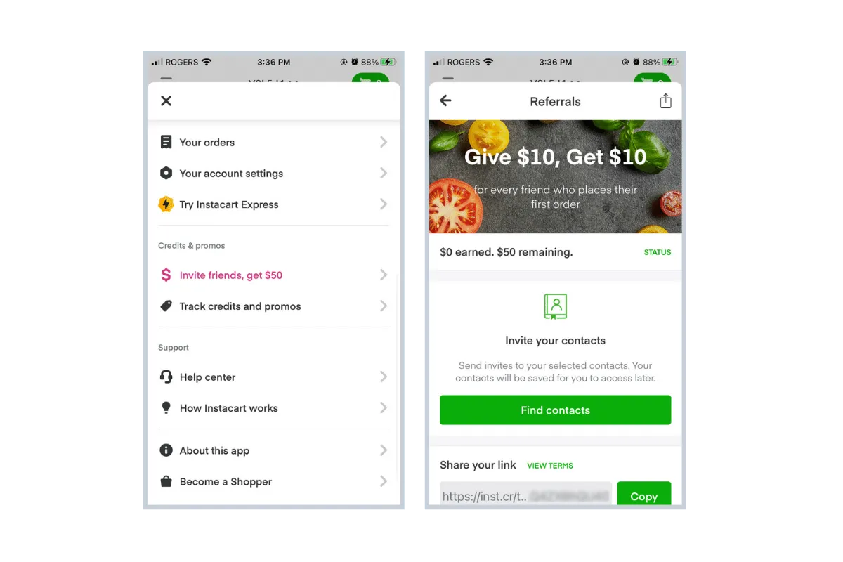 Instacart is an online grocery ordering app that lets you select items from your favorite store, chat with your personal shopper, and experience smae-day delivery or pickup.
Referral Program Setup: Refer up to 5 friends and they’ll get a $10 credit on their first order, and you’ll get a $10 credit once their first delivery is complete.
What we like about it:
- Since customers can earn up to $50 in total referral credits, the app quickly entices mobile users with the "Invite friends, get $50" prominent, pink link placed high up in the main menu.
- Adding a Status bar at the top of the referral page means customers have a consistent reminder of the rewards they might be missing out on, encouraging them to claim what's free when they invite a friend.
6 - DoorDash
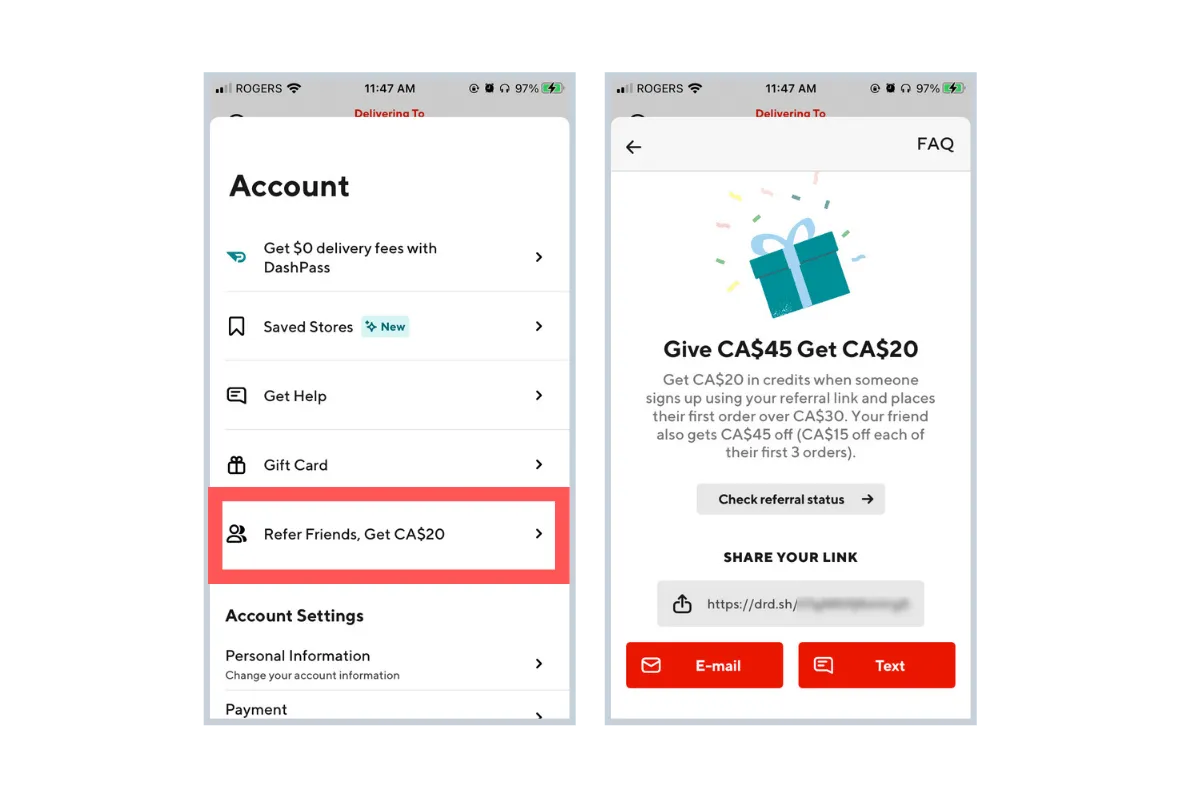
DoorDash is an on-demand food delivery service that lets you order food from restaurants in your area. Similar to UberEats and Skip the Dishes, DoorDash deliveries are done by freelance drivers unaffiliated with the actual restaurants.
Referral Program Setup: Refer a friend to DoorDash and get $20 in credits when they sign up and place their first order. Your friend will receive $45 in credits, in the form of $15 off their first three orders.
What we like about it:
- By spreading out the referred friend’s reward over three separate orders, DoorDash uses its referral program as a way to build long-term customers. New customers are more likely to use the service more than once in order to claim their full reward, increasing the likelihood that they will incorporate DoorDash into their regular meal routine.
- The referral program call-to-action is conveniently featured in the Account menu, giving users easy access to the program without the need to scroll through multiple levels of navigation. Plus, the referral screen itself offers a good amount of finer detail while still keeping the layout simple.
7 - Airbnb
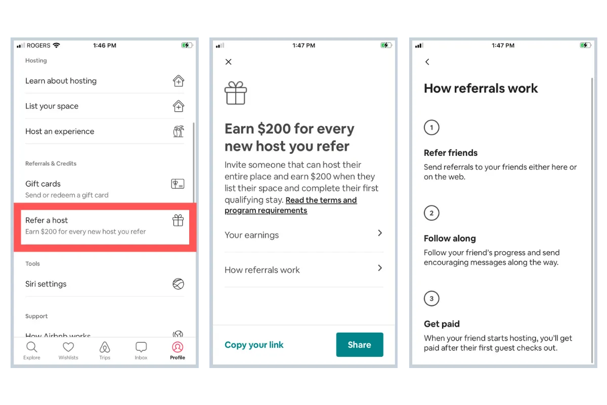
Airbnb is an online marketplace for arranging and offering accommodation. Anyone can apply to list their real estate and become an Airbnb host, while travelers can find lodging at cheaper prices than the average hotel, or just a unique place to stay.
Referral Program Setup: As of September 2021, the Airbnb mobile app features referral and credit options to refer hosts, while previously the referral program included inviting both travelers and hosts.
Refer a host: When your friend signs up to be a host and completes a reservation, you get $200.
What we like about it:
- Airbnb exists as a result of the sharing economy, and relies on recruiting a network of hosts and travelers. Without both parties involved, the ecosystem cannot function. As travel ramps up again post-pandemic, there will be a high demand of places to stay, making it smart to focus on bringing in new hosts.
- Having a dedicated profile menu section for "Referrals & Credits" makes the program easy to find, and includes all of the necessary instructions and information to get anyone started with referring.
8 - TaskRabbit
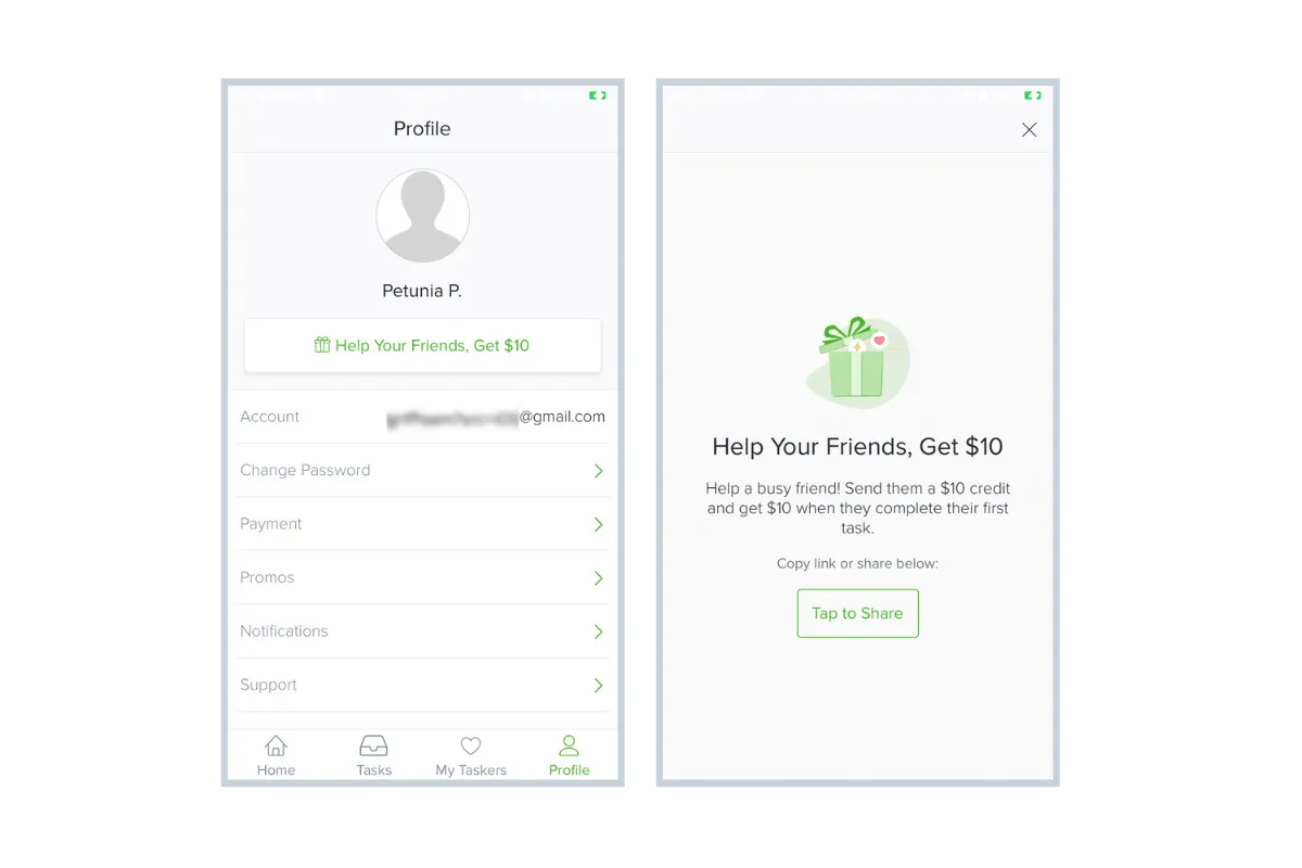
TaskRabbit is an online and mobile marketplace that connects you with freelance laborers to help with everyday tasks like moving, cleaning, and handyman work.
Referral Program Setup: Help Your Friends, Get $10 - Send your friend a $10 credit and get $10 when they complete their first task.
What we like about it:
- Instead of using a CTA of “Give $10, Get $10” like most programs, TaskRabbit’s program is purposefully advertised as “Help Your Friends, Get $10”. Rather than just an exchange of money, it’s positioned as a way to make you feel like you can help friends ease stress and tackle their to-do lists - all while being rewarded!
- The “Help Your Friends, Get $10” CTA is dispersed nicely throughout the app, and your unique link can be shared quickly with one tap.
- TaskRabbit’s default share messaging effectively communicates the value of using the app and why the new user should check it out.
9 - Tile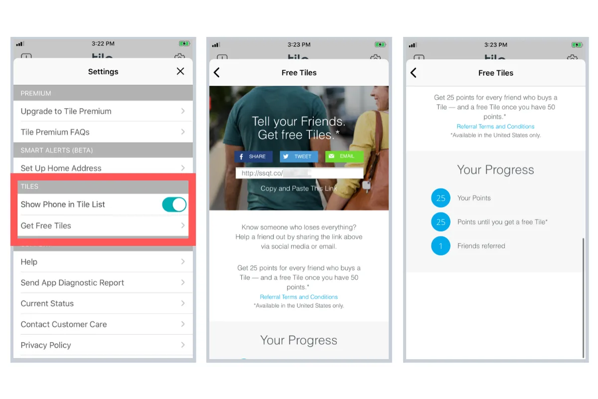
Tile is a tiny Bluetooth-enabled tracker that helps you locate your items quickly through the Tile companion app. Tiles are commonly used to keep track of wallets, purses, and other valuable items.
Referral Program Setup: Get 25 points for every friend who buys a Tile, and receive a free Tile once you have 50 points.
What we like about it:
- Tile begins the referral proposition by asking a question: “Know someone who loses everything?” We can all probably answer ‘yes’, which sparks our interest in what we can do to help our friend solve a common problem.
- The brand gamifies its referral program by letting you rack up points to earn a free Tile. The referral screen clearly displays your progress towards a reward, motivating you to reach your goal and refer more friends.
- Instead of a traditional "Give $, Get $" model, the app lets you explicitly "Get Free Tiles". With every new Tile, you become more invested in the brand and its value proposition, ideally fuelling more referrals.
10 - Rover
Rover is an app connecting pet sitters and pet owners. Easily find a sitter to take care of your pet while you're away, or make extra money looking after other animals.
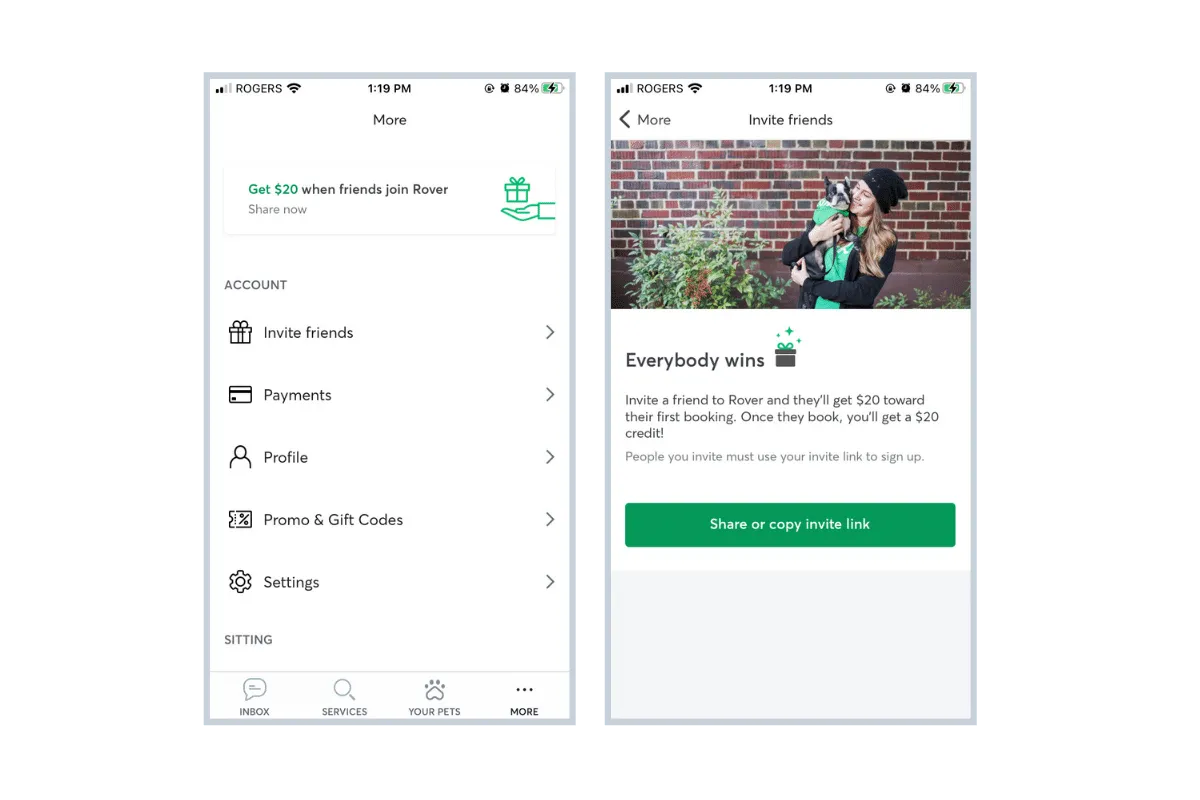
Referral Program Setup: Give $20, Get $20 - Invite a friend to Rover and they’ll get $20 towards their first booking. Once they book, you receive a $20 credit.
What we like about it:
- Rover's referral program fits cleanly into its app and is emphasized by pops of color amidst a mainly grey and white color palette.
- The referral program CTA takes precedence on the "more options" menu tab, giving it the in-app promotion it deserves.
- The "Everybody wins" tagline on the referral screen promotes the reciprocity of the program, making everyone feel comfortable initiating/accepting offers.
What would make it even better:
As Rover already utilizes imagery of people and pets on its referral screen, this would be a great place to feature top referrers and their pets. For example, if a customer refers 10 new users, enter them into a draw to have a photo of them and their pet featured on the referral screen for a week.
11 - Newton
Newton is a cryptocurrency trading platform allowing Canadian users to buy and sell on any device with access to some of the best prices. Users can access their wallets from either the web or mobile app.
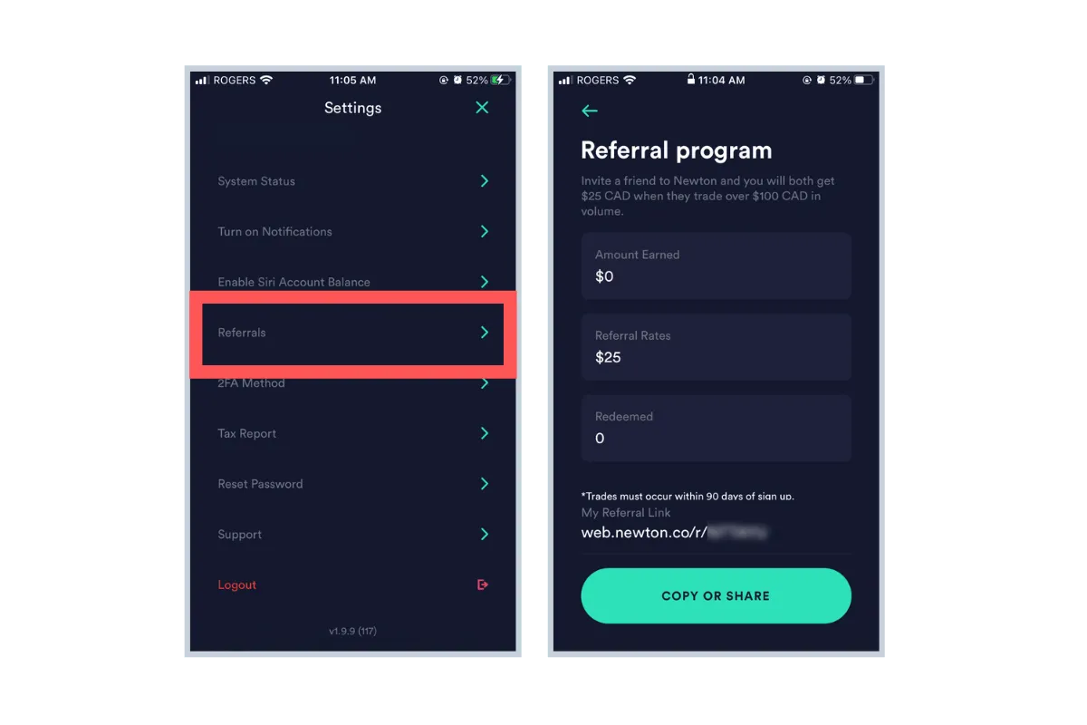
Referral Program Setup: Refer a friend to Newton and you’ll both receive $25 when they sign up for a Newton account and make their first trade.
What we like about it:
- Sometimes when brands have both a web and mobile app, users can only access a very scaled-down version of the referral program when on a mobile device. Newton does a good job of ensuring that referral stats, instructions, and codes are clearly laid out in the mobile app to offer a complete experience.
- Like many of the examples in this list, the referral program is seamlessly integrated into the mobile app, leaving no room for speculation or confusion when accessing the program. Friction is most often created when participating in the referral program means opening a separate app (like an internet browser) or having to log in again.
Best Practices for Mobile Referral Programs
What can we learn from these examples? Here are our top tips for creating a mobile referral program that engages customers and fuels your growth.
Offer valuable rewards (that also benefit your brand)
Many of our examples above offer in-app credit, features, or merchandise as rewards. This is an excellent way to promote further product usage, and you can be confident you’re offering something that your customers will be able to use instead of guessing their preferences.
By linking rewards to revenue-generating activities (ie. booking a hotel, reserving a dog sitter, requesting a ride), you can lower the financial impact that rewards have on your bottom line.
For more guidance on choosing the best rewards, check out this article.
Create an easy-to-understand catchphrase
The best referral programs aren’t complicated. This is why offers like “Give $10, Get $10” are so widely used. Terms and conditions aside, they clearly communicate the incentive in participating.
If your referral program’s general rules can’t be displayed clearly on a single screen in your app, it’s probably too complicated. Assume that users will not scroll down, so make sure all important information can be displayed “above the fold”.
Using a separate link to “Learn More” or “How it works” is also standard practice to explain any other program details.
Make it easy to find
In addition to creating a general promotional strategy for your referral program, make sure it’s easy to find once users open your app. The best apps dedicate a space on their static menu bar as a quick link to the referral screen, plus extra links in “account” and “settings” pages to maximize exposure.
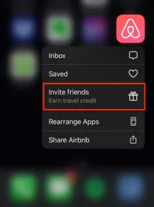
As a creative example, Airbnb’s app development team took advantage of the 3D touch feature on modern iPhones, which let users access options simply by pressing harder on the screen. The brand integrated its referral options right into this menu for quick access:
Make it easy to refer
While consumers spend more time on their phones, this doesn’t mean their patience has increased. Make it as easy as possible for users to share their referral links and codes with friends by offering multiple ways to share (ie. WhatsApp, Facebook, Email, SMS).
Asking users to copy, paste, and open up a new app to share their link can be enough of a bottleneck for them to abandon the referral altogether. Notice how in all of the apps we explored above, unique referral codes and links are already generated so the user doesn’t have to go through extra hurdles.
Have it well-integrated into your app
As you can see from all of the examples above, the branding of the referral screen perfectly matches the rest of the app in terms of color, font, and general tone.
As a user, if you click “Invite a Friend” and are redirected to a website that looks nothing like the brand’s native app, you’ll not only be confused, but become skeptical if you can trust the new page you’re on.
Make your default messaging exciting and enticing
For various share mediums, equip users with default messaging that they can send to friends with their link/code. This is your opportunity to explain the value of the offer in your own words, while users can still customize it.
Here's an example from TaskRabbit that effectively communicates what the app has to offer: "I'm using TaskRabbit to tackle my to-do list! Make life a little easier with help for everyday home projects. Get $10 off your first task." This is much more enticing than "Hey, use my code to get $10 when you sign up for Task Rabbit"
Focus on the new user's experience
While it’s important to create a smooth referral experience for your existing customers, consider how you will simplify the process of a new user entering their friend’s referral code or link. They should be able to create an account quickly, with their discounts or credit automatically applied, and be directed to the best area of the app for them to get engaged.
This is where using a mobile deep-linking platform like AppsFlyer or Branch comes into play. They're used to make sure that referrals to your mobile app get attributed correctly, even if the referred user needs to visit the app store first. Deep linking platforms help you boost conversion rates, create a frictionless user experience, and attribute each mobile referral and signup. Learn more.
Who didn’t make the list and why?
We scoured the world of apps to pick out the best mobile referral programs. Why didn’t some make the list?
Technical Difficulties
Technical difficulties were more common than we expected. Some offered a troubling user experience when the “Invite a Friend” button simply didn’t work, or the area to input friends' email addresses remained blank after typing.
How to solve it: Leverage a dedicated referral software provider who can help integrate a smooth experience into your mobile app.
Lack of Visibility
If no one knows your referral program exists, they won’t use it. Burying the link to your referral program under multiple menu layers is a surefire way to lower engagement.
Even after locating the referral program area, it was often confusing on how to share your link, what to share, and what would happen if you did share it.
How to solve it: Like many of the apps on our list above, put your referral program front and center so that users are reminded to invite every time they open your app.
Poor Incentives
Some referral programs favored either only the referring user or only the referred user. The former can make your users feel like salespeople, and the latter can reduce motivation to refer. There are certainly use cases for single-sided rewards, such as when a service is completely free like Duolingo.
How to solve it: Level out the playing field by using double-sided incentives. By leveraging the rule of reciprocity, you’re more likely to drive action from both the referrer and referred user.
Final Thoughts
If you want to get more referrals, you need to engage customers where they spend the most time - on their phones. But an expectation for high-speed and efficiency require your mobile app's referral program to grab a user's attention and provide a seamless experience.