27 SaaS Webinar Marketing Examples
Webinar marketing is used by B2B companies to share their industry expertise and start a conversation with prospective customers that are further down the marketing funnel. Let’s take a look at how a few leaders in SaaS are using webinar marketing to nurture their high value prospects.
Uberflip
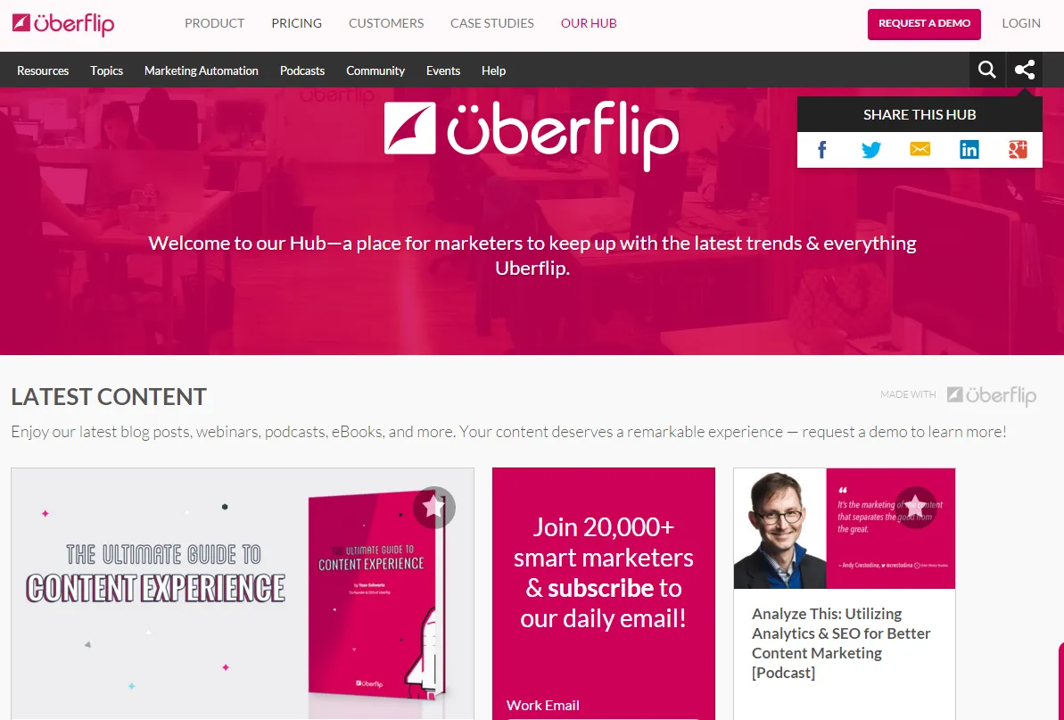
Uberflip helps companies aggregate and manage their content on a single platform. In fact, a few of the webinar site examples that we’re looking at today use their solution.
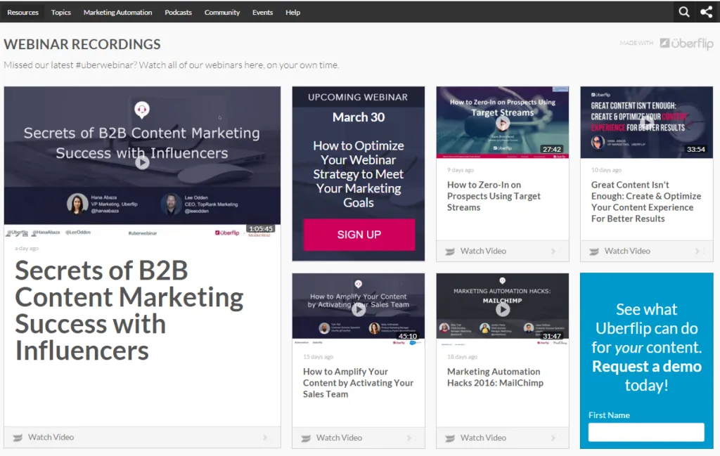
You’ll notice that content here is labeled by Read Article, Watch Video, View Post, and more. Drop down menus at the top of the page allow all this content to be sorted by type of resource, topic, and a variety of other methods.
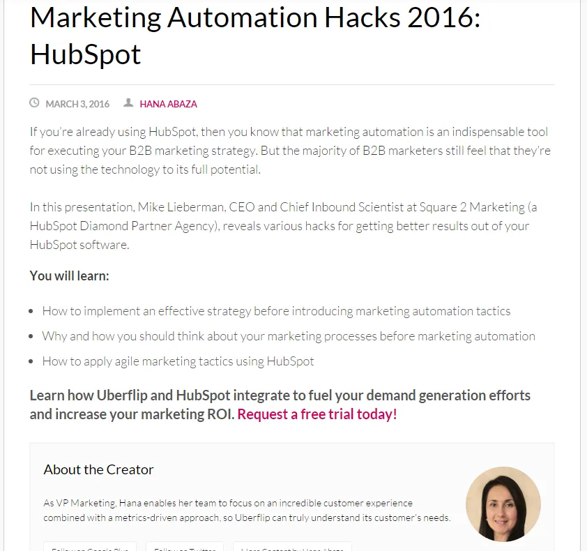
“You will learn” ←- three powerful words that immediately inspire trust in the content. This is especially effective when followed with concrete examples of what the lesson ahead contains. A way to further build trust is to include an about-the-creator section laying out the author/host’s expertise and title.
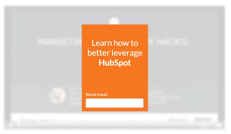
The way Uberflip asks for lead generating information is very interesting. Initially, the viewer sees a single field (as seen above).
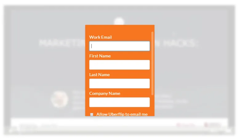
Clicking that single field expands the form to reveal three more boxes to fill out. Since the viewer has already committed to one field, they’re likely to complete the rest.
Uberflip offers a wide variety of content arranged using their personal expertise. There’s plenty of content marketing know-how to dig into here and I highly recommend doing so.
Kissmetrics
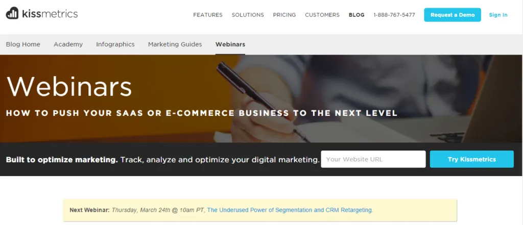
Kissmetrics is all about helping SaaS and eCommerce clients optimize their marketing tactics through a suite of analytics. Their webinars are filled with helpful advice with a focus on how data can unlock the potential of any campaign.
Right off the bat Kissmetrics is advertising their upcoming webinar. Just by surfacing a simple time and title, they’re already creating excitement around their next webinar event.
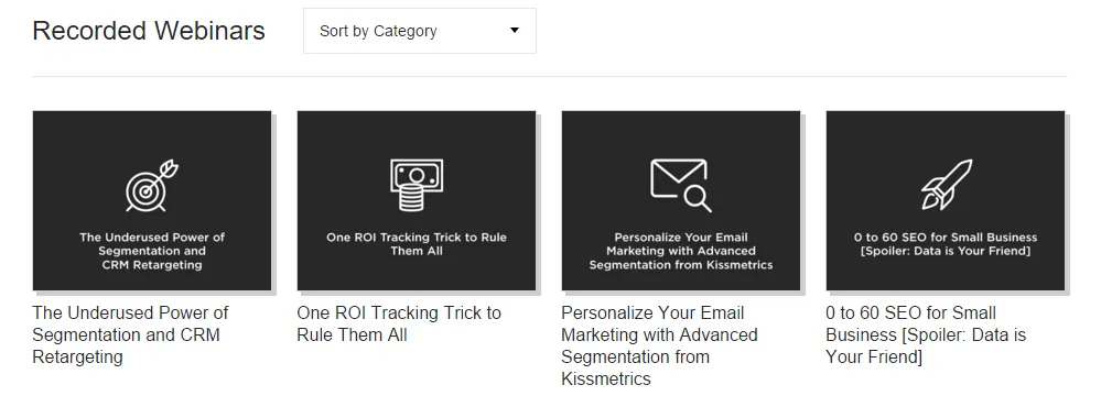
It’s awesome that the webinars here are sortable by category and the individual icons for each draw the eye. It’s also nice to see someone having fun with a few of the titles, a little bit of humor helps a piece stand out from the pack.
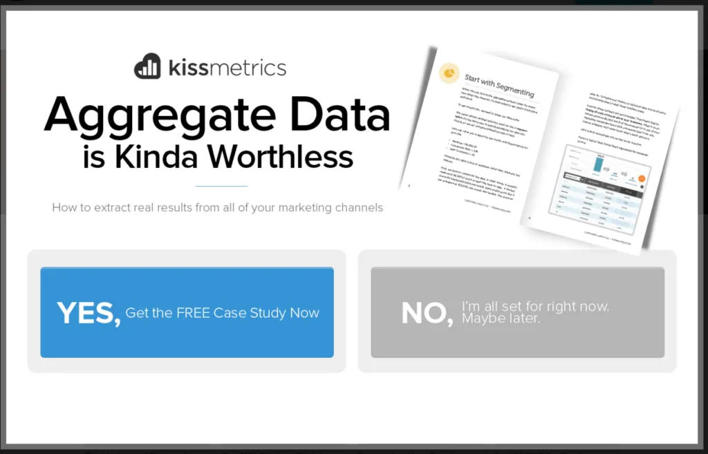
Side note: not all pop ups suck. Here’s a great example of one that works. Kissmetrics draws attention to their case study using humor and a very clearly laid out message.
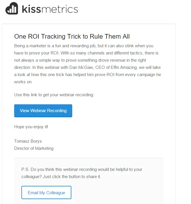
Kissmetrics delivers the invitation to view their webinar through email. It’s a simple click through to the webinar, but it’s important to note that this is only just the beginning of their campaign. Over the next week a series of emails from Kissmetrics Director of Marketing Tomasz Borys will appear in your inbox highlighting what this company can do for you.
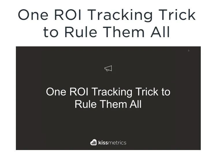
Once you’ve clicked through the email, you’ll find yourself on a plain page with the embedded webinar and the opportunity for a 14-day free trial.
Kissmetrics has set out a streamlined path with their webinars. They’re easy to find, informative to watch, and it’s interesting to see their tricks for engaging a potential future client.
Wishpond
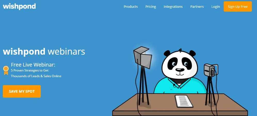
Wishpond’s online platform and tools allow customers to build landing pages, website pop ups, lead generation forms, social promotions, and more using visual editors.
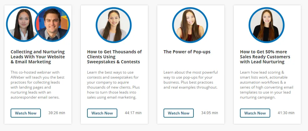
The Wishpond webinar page is very simple. Their current four webinars are clearly laid out showing the host, title, viewing length, and a short blurb explaining the lessons within.
I especially like that each webinar includes an image of the host. It helps returning users spot their favorite speakers at a glance.
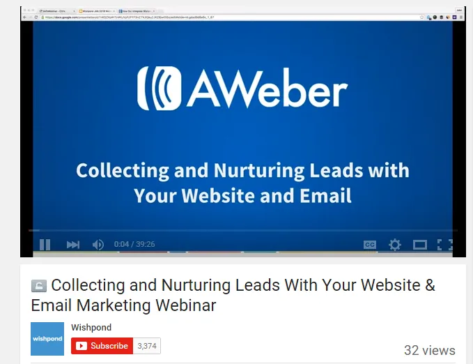
Unlike many of the other webinar sites we’re looking at today, Wishpond keeps their webinars on YouTube. Although it takes the viewer away from the Wishpond site, this is an easy, inexpensive way to host content and make it as shareable as possible.
HubSpot
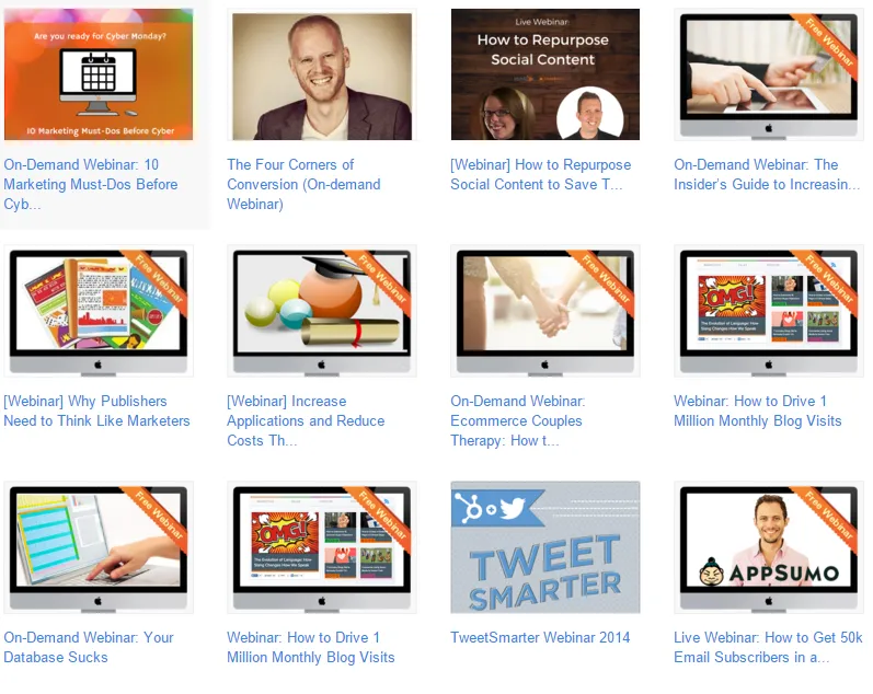
Inbound marketing giant HubSpot is best known for their sales software and marketing platform. It also hosts an amazing collection of resources for marketers of all stripes.
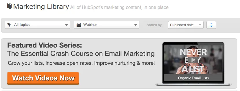
The HubSpot marketing library is huge and frankly, a little intimidating at first. Because of the sheer amount of content, HubSpot has done a lot to make it accessible. First off, see how the list is sortable by topic and content type? This, combined with the ability to arrange by publish date and title makes for a much easier time of finding desired content. Secondly, the Search and Recently Viewed Content options are excellent for returning users.
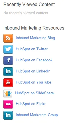
Side note on the side bar: All of HubSpot’s social media channels are listed for easy access..
Webinars on HubSpot come in two flavors: On-demand and Events. On-demand webinars can be viewed at any time from the HubSpot marketing library with the sole requirement being filling in the lead generation form.
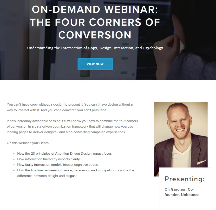
Event webinars are a little different. They still require a completed lead generation form, but they happen at a specific time. By listing these webinars as timed events, HubSpot is able to generate excitement around them.
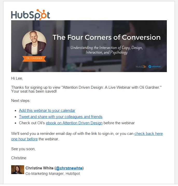
Once you’ve signed up, you’ll find a save-the-date style email sitting in your inbox. This email is later followed by an invitation to view the webinar on the date of the episode. Once the event is over, HubSpot adds the webinar to their ever growing marketing library for future viewing.
HubSpot has made a name for themselves in the content market and it shows in the way they deliver their webinars.
Unbounce
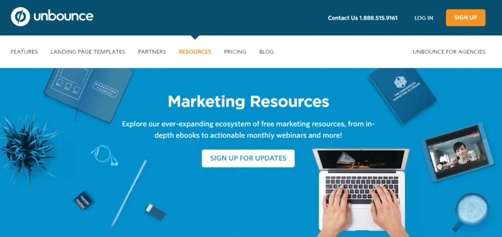
Unbounce is a marketing platform that helps companies create full-featured landing pages.
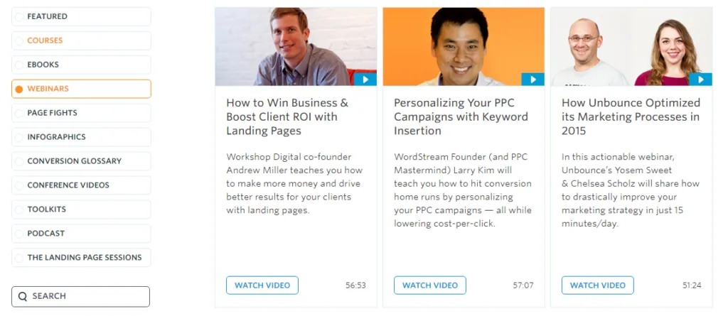
Webinars are easily found in the resources section of the Unbounce website. As Unbounce has a significant amount of articles, courses, ebooks and webinars available, having sorting and searching options makes for a much easier experience. Notice how each webinar displays a clear title, a short summary, and the video length. This helps the searcher find exactly what they’re looking for in record time.
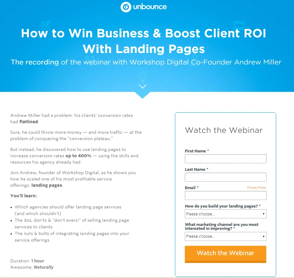
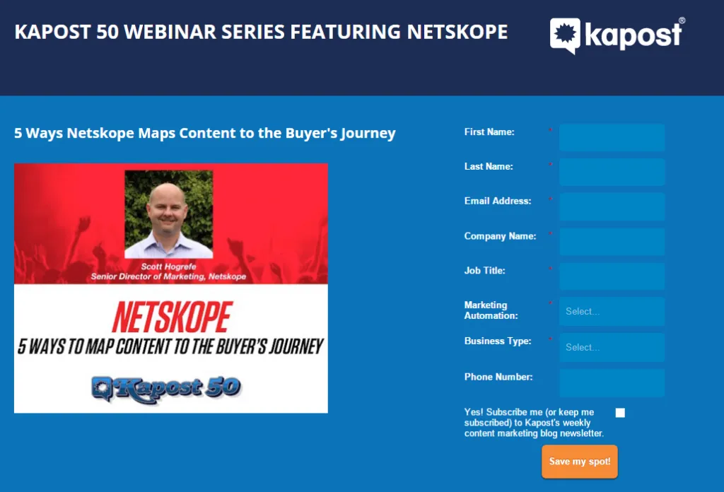
Tapping the Watch Video button opens a new tab (great for folks looking for multiple webinars!) with the webinar’s landing page. Here we find more information on the webinar and a few blanks to fill in to gain access to the video. By including drop down choices for the two qualifying questions “How do you build your landing pages?” and “What marketing channel are you most interested in improving?” Unbounce makes gathering a general sense of what the viewer is looking for a snap.
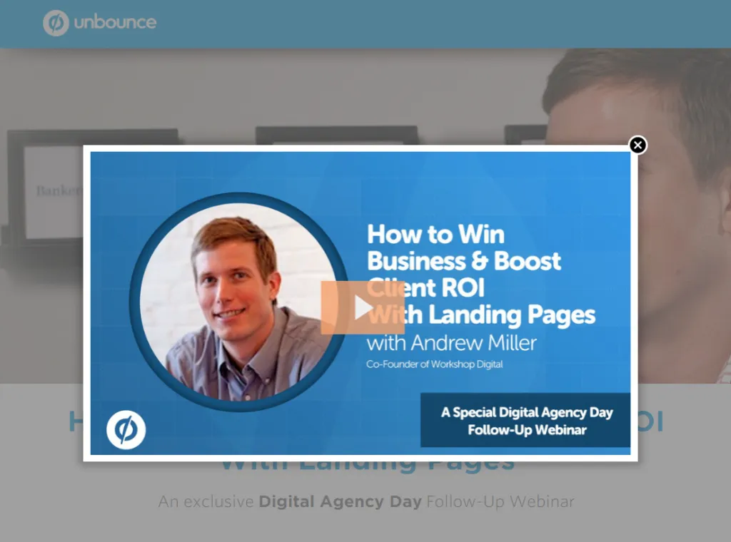
Unbounce embeds their webinars within their site. This allows control over who sees their content, but in exchange for shareability. You’ll also notice that the page the webinar is hosted on is a repeat of the previous summary. However the form just filled out has been replaced with a free trial offer for Unbounce’s service and demo scheduling option. This is a great way to reuse content and resurface the webinar’s key points.
Kapost
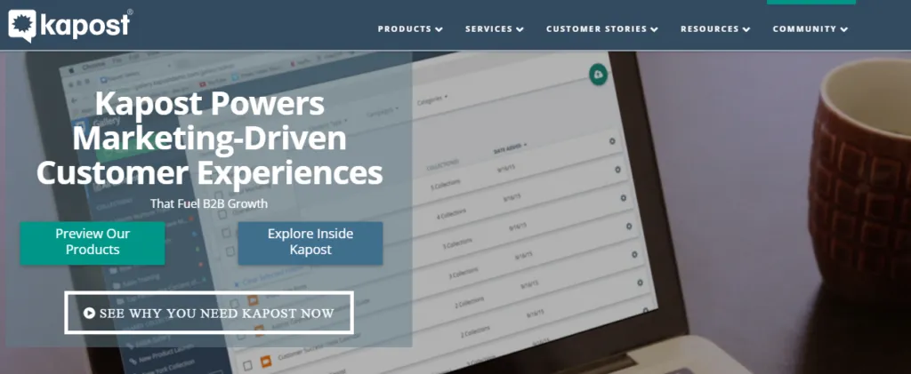
Kapost is a content marketing platform that helps companies manage the production and promotion of their content with a variety of tools.
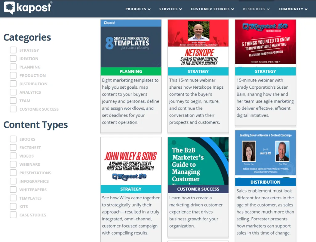
Again, sorting and searching makes for a much easier experience, especially when you have so many different kinds of content to share.
The team at Kapost has done a lot to streamline content and delivery for viewers. By clearly labeling the type of content as Customer Success, Strategy, Distribution, and more, a viewer can quickly pick out topics of interest. Similarly, Kapost’s webinars tend towards the 15 minute mark, making them very attractive to the marketer on the go.
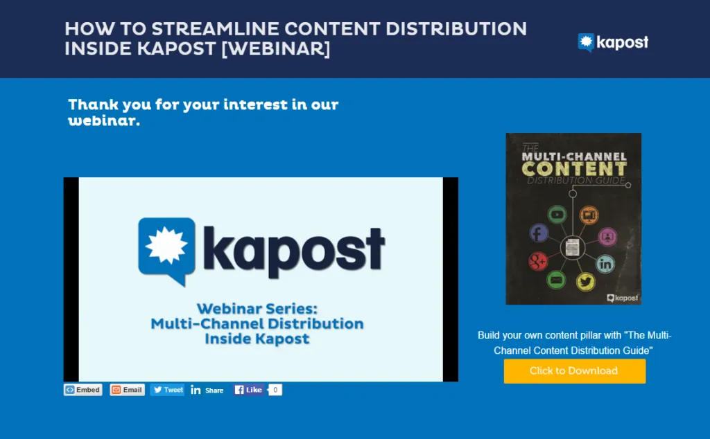
Like many of the other sites we’ve looked at, Kapost embeds their webinars on a page, however they also include buttons to share the webinar using Facebook, Linkedin, Twitter, and email. Additionally, offering an embedded link to the webinar is an aid to bloggers wanting to spread the word.
One particularly smart idea that Kapost has had here is to include a side ad for an ebook touching on the same topic as the webinar. If I’m intrigued by the lessons in the webinar, I’m certainly going to download an ebook with more advice.
Overall, Kapost’s webinars are easy to find and access. They do a fantastic job in making their content shareable and by offering related content Kapost’s team is sure to engage their viewers.
Let’s review some of the simple ways these companies have set themselves up for success.
Save the date. If your webinar is a timed event, send a booking notice and reminder to every attendee. It’s a great way to engage the subscriber and get them to mark the event on their calendar.
Add sort and search. You’ve got the content people want. Help folks find it with ease. Adding these features early will help down the road when your resource library is overflowing with excellent articles and webinars.
Label it. You’ve put hours of work into your webinar. A clear title and summary will help clients choose to watch it. This is a great opportunity to introduce your presentation with personality.
Offer more. Once the viewer is finished with your webinar, they’re likely going to want to follow up. Give them options to sign up for free trials, 1 on 1 demos, or related ebooks.
Send a note. You have their email from your lead generation form follow up to say hi and a little more information about the webinar they were interested in. This is an excellent opportunity to give them a link they can share with their team.
Images sources: