14 Behavioral Email Marketing Examples
The inbox continues to evolve and become an essential part of the customer experience in 2016. In this article I’ll show off brilliant examples of using product and customer data to trigger personalized email marketing campaigns.
Airbnb – Behavioral email marketing example – Next Day Listing View
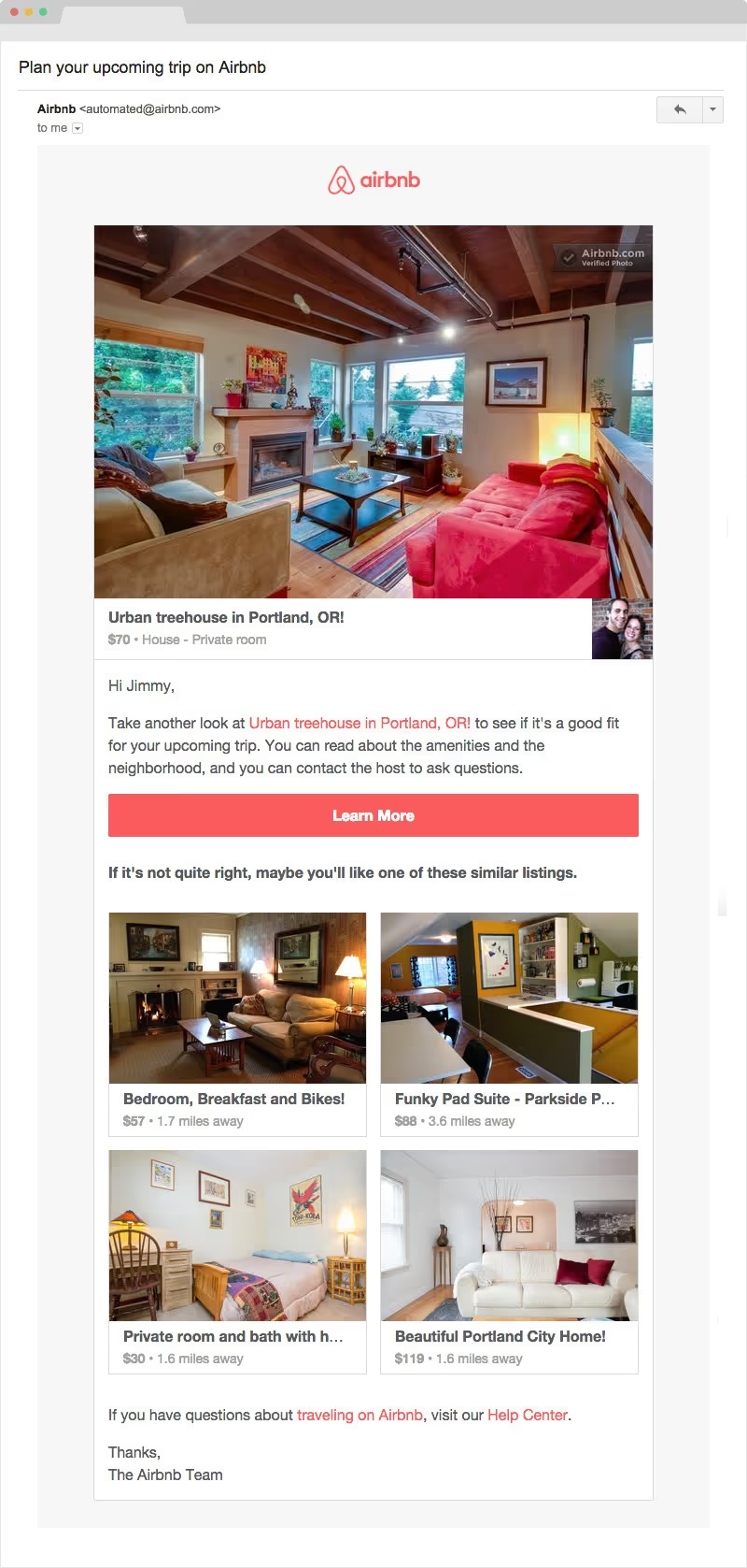
Airbnb sends customers an email 1 day after they view a listing but don’t complete the booking. They pull in the exact listing the customer viewed one day earlier as well as relevant listings in the same price range and location. This addresses the plague of shopping cart abandonment in a highly personalized way that leads the customer back to the product so they can pick up where they left off.
Apple Music – Renew Subscription with Auto-Renewal
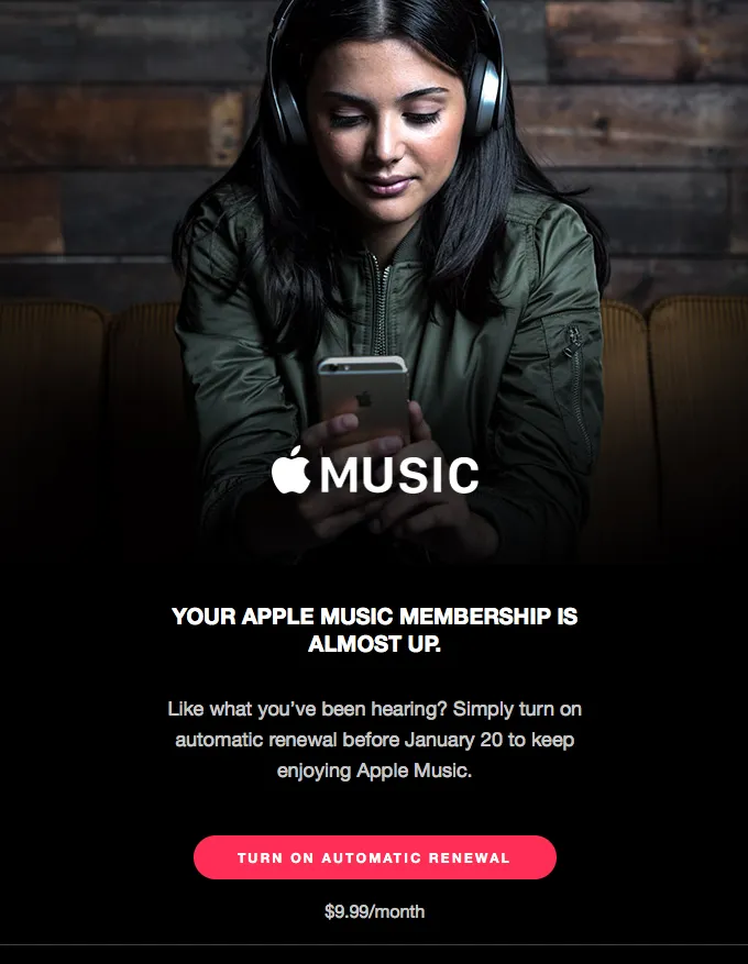
Apple sticks to their core branding of simple and beautiful with this lifecycle email marketing campaign. Using a high-res image with a contrasting red call-to-action leads the customers’ eyes towards the intended goal. Note that Apple’s goal is not just signing another membership but for the customer to set up automatic renewal. This clever copy trick will help reduce subscriber churn for their product.
MeUndies – Blog subscriber – Get started discount
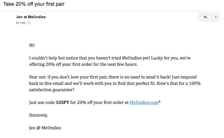
Within the first few days of becoming a blog subscriber MeUndies sends customers a plain text email with a 20% off first purchase discount. The email is simple and clean with no extra words to distract from the primary goal of getting the potential customer to make a purchase.
Handy – Welcome Email – 1-2-3 Layout + Referral Marketing + Mobile App Download
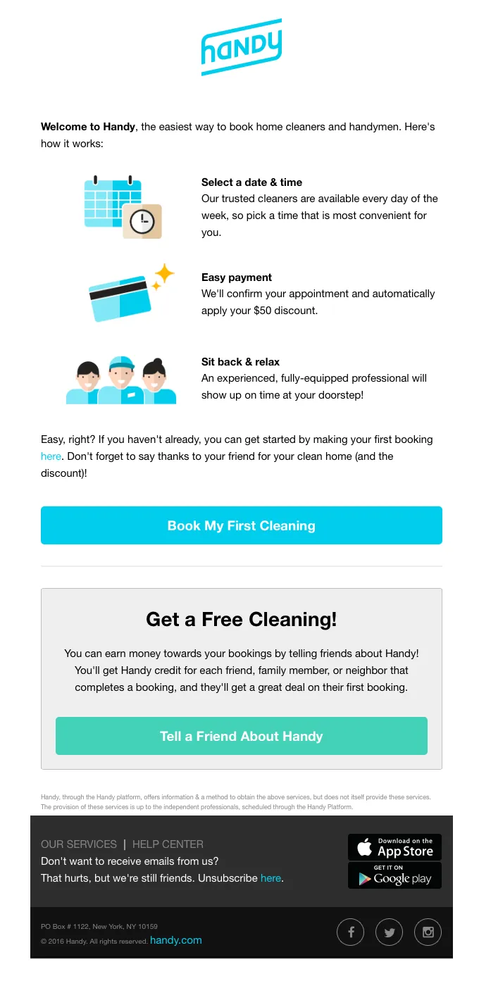
When a customer signs up for Handy they send the standard 1-2-3 layout welcome email. Highlighting the value of using the home service marketplace and how they earn their first-time $50 discount.
What’s interesting about this email is the use of different CTA’s throughout “Book my first cleaning” + “Tell a friend about Handy” + “Download us on the App Store” + “Get it on Google Play”
Each CTA is separate from the content used, but it feels that they’re forcing too much messaging into one email. Giving the customers too many choices can make a customer confused and end up not making a choice at all.
This is called ‘the Paradox of Choice’ which is a fascinating consumer behavior to read up on to improve your customer experiences.
- ‘Paradox of Choice’ was popularized by American psychologist Barry Schwartz in 2004.
Netflix – Behavioral Email Marketing Example – New Content You May Like
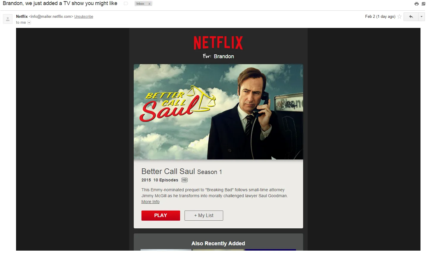
Netflix and Amazon are the kings of recommendation and it continues with this behavioral email they sent me. Based on my in-product viewing behavior they highlight shows they’ve recently added that would be relevant to me. Content discovery continues to be the biggest draw-back for Netflix users and emails like this at the beginning of the month help to re-engage current customers so they continue getting value from the service. Highly personalized re-engagement emails will keep your customers active and will reduce subscriber churn.
Slack – Direct Message Notification
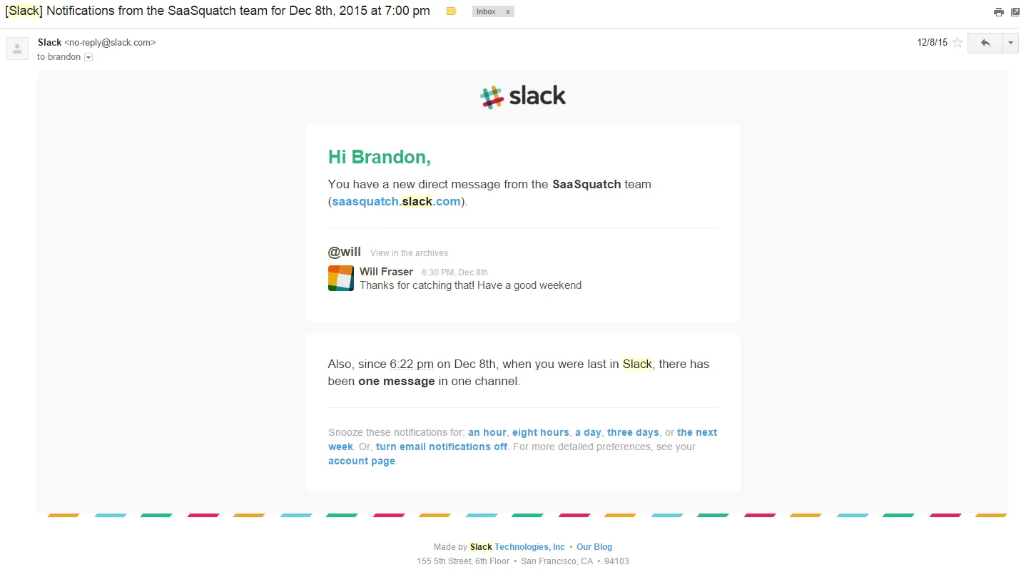
Slack uses these triggered emails to get your attention and keep using their product when you’re at work. This email helps show the core value of the service for both users and serves as a dual-sided trigger. As each successful response we receive deepens the engagement with the product and quickly turns itself into our go-to workplace communication tool. If you’re interested in learning more about creating habits with software products – Nir Eyal’s writing and presentations on the subject are fascinating.
Mint – Weekly Financial Summary
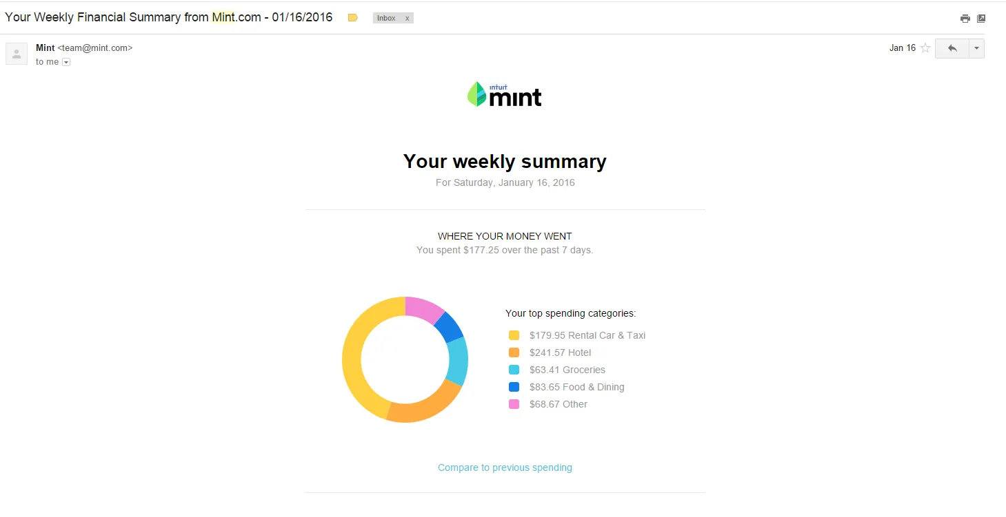
One of my favorite weekly emails comes from my Mint App. Pulling in my spending data from all the different in-app spending categories and visualizing it in a pretty donut chart. Even if I’m not in the app every day, this weekly summary email keeps me engaged with the product.
Inbound.org – Email Notification – Relevant Topic Discussion
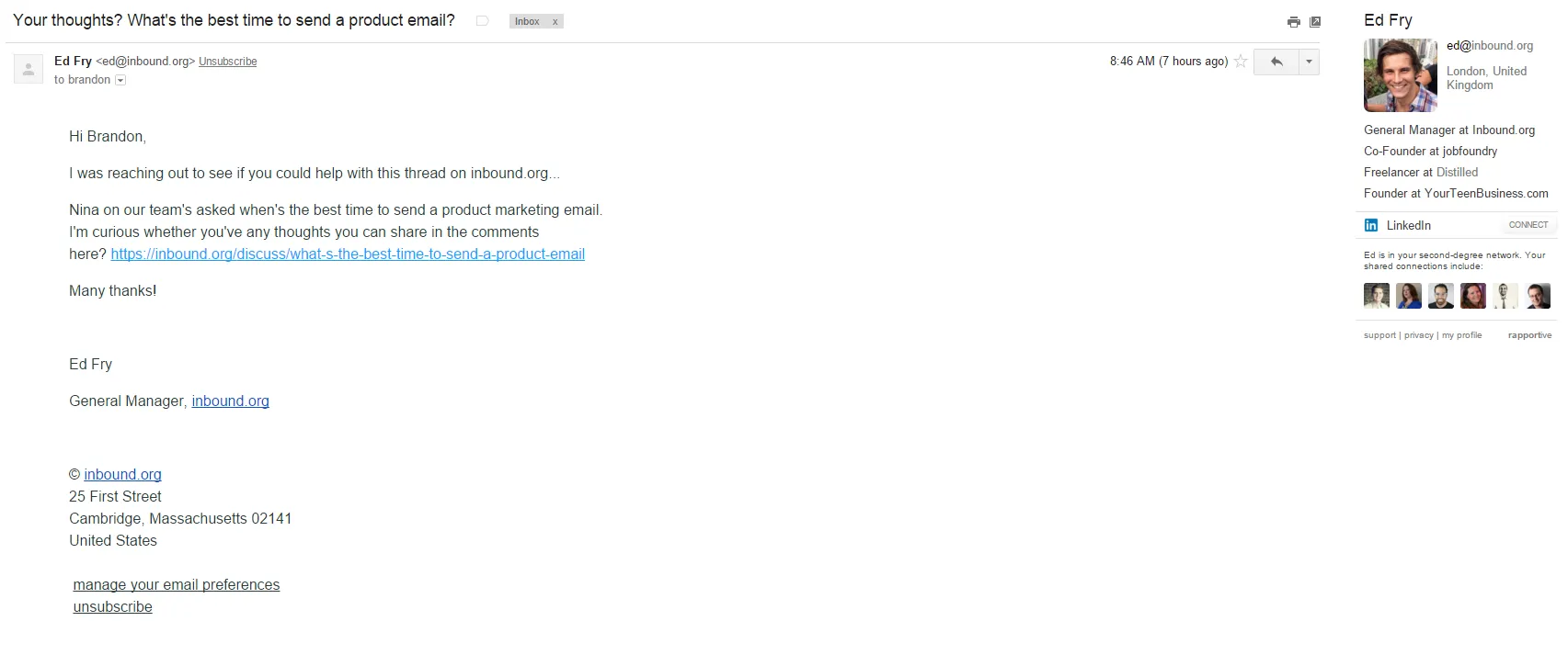
Inbound.org sends a triggered email to a discussion thread asking for my contribution. Customizing the segment that receives the notification based off of profile interests. IE I indicated that I’m interested in email marketing so they notify me when an email marketing discussion arises.
Mention – Daily Summary Email – Today’s Top Mentions
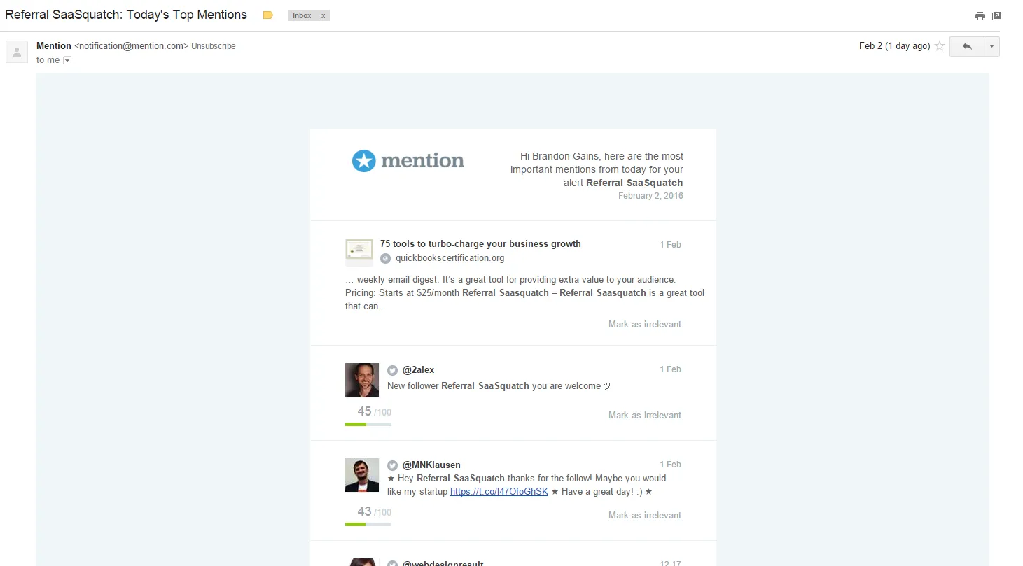
Similar to the Mint example above, Mention uses this daily mention email to deliver the core value of their product in an email summary. Helping their customers keep tabs on their mentions from the comfort of their email inbox. Daily and weekly emails like these help to build product-usage habits that increase adoption/reduce churn.
Mailchimp – Daily Summary Email – List Status Update
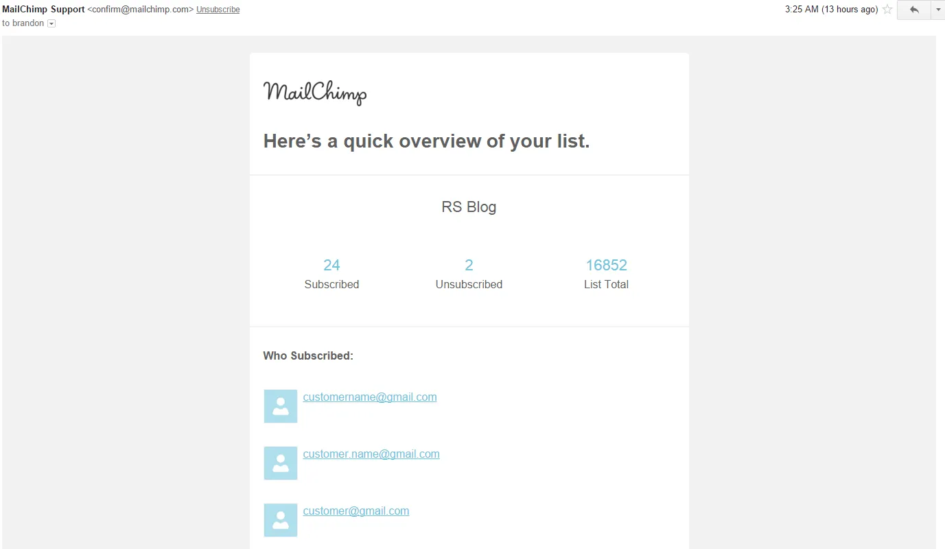
Similar to the Mint and Mention summary emails Mailchimp uses a daily email to give users a quick overview of how their list is performing. Hyper-linking each variable to get users back into the product.
Textbroker – Customer Lifecycle – Education Onboarding
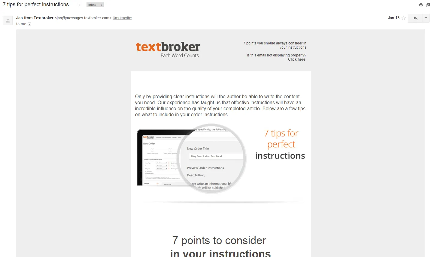
Not all triggered emails have to push users towards a purchasing decision. This email from Textbroker is part of a lifecycle series that is focused on educating their potential customer. By giving them a quick post detailing what it takes to create project instructions Textbroker helps their potential customer create better project scopes, which in turn helps them create projects on Textbroker.
Tile – Customer Referral Marketing – Triggered Success Email
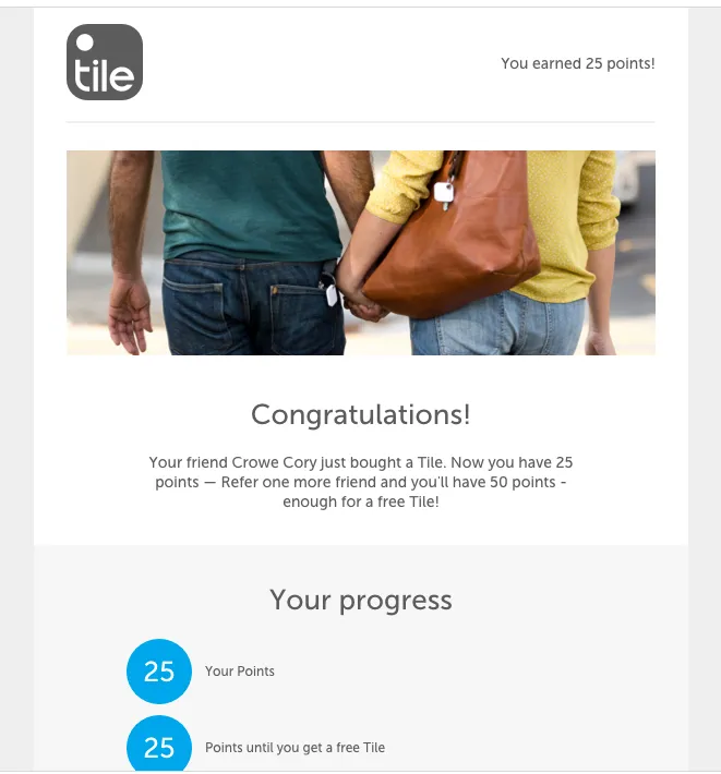
Our client Tile uses our triggered email notifications to tell users when a successful referral happens. Targeting a customers’ happy moment as they just earned 25 points helps reinforce why they wanted to refer your company/product in the first place. They also use the email to pull variable data from our platform to update customers on their progress and to encourage the customer to make more referrals.
Ghost – Customer Referral Marketing – Triggered Success Email
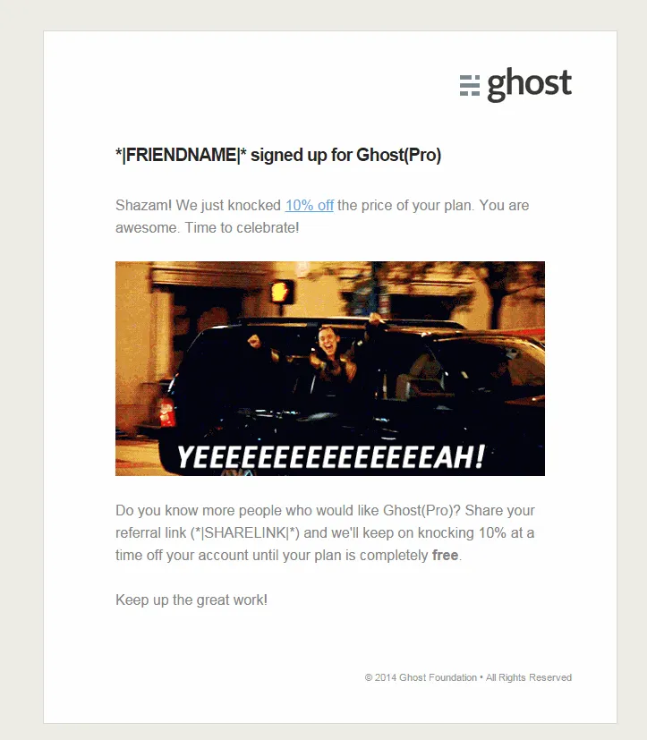
Ghost uses a funny GIF to tell users they’ve earned 10% off their program. Taking advantage of the happy moment they created by giving the customer a reward. The email pulls in personalization variables like the referred friend’s name and their unique referral link to encourage additional referrals.
Dropbox Paper – Customer Onboarding Email Example 1-2-3 Layout
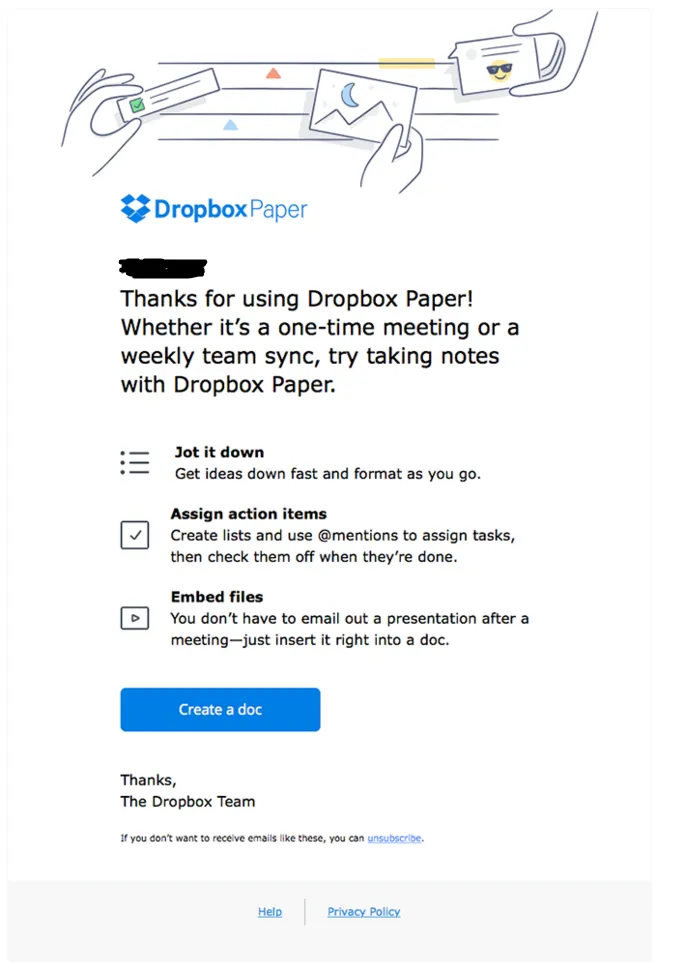
Dropbox Paper uses the standard 1-2-3 onboarding email layout to clearly show the user the value of using their product. Leading the user’s eye to a big blue call to action button to ‘Create a doc’ so there’s no question in their mind about next steps. The email is a simple and smart way to get users engaged with the product.
Sources – Shout out to Really Good Emails and Vero for their examples.
Quick update on Referral SaaSquatch –
More and more companies from a wide variety of industries are adopting referral marketing and SaaSquatch HQ is buzzing with activity. As a result we’re quickly ramping up our Sales + Success + Product teams to handle all you wonderful customers 🙂